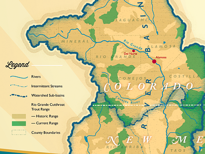
Poster Detail - Retro Lettering

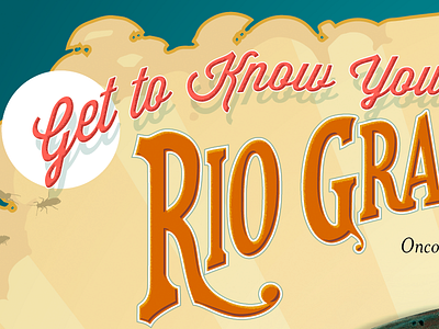
Feedback wanted! The main type is a re-drawing of stretched Chaparral Pro; the script is Wisdom Script, whose time may already have come and gone—that's fine. Trying to go for a twist on 40s color palette. Couple of questions—thoughts on color palette to explore? Also, I love the drop shadow on the script, but don't really want it on the title. Is that so wrong?