Find designers
Designer search
Quickly find your next designer
Post a job
The #1 job board for design talent
Inspiration
Courses
UX Diploma
Learn UX design from scratch in 6 months
UI Certificate
12-week UI skill building for designers
Live interactive workshops
with design professionals
Jobs
Go Pro
Log in
Dribbble: the community for graphic design
Log in
Sign up
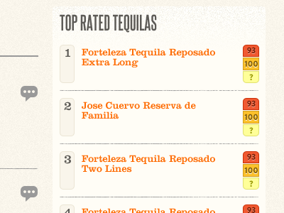
Sidebar Ratings
John Peele
Available for work
Follow
Following
Like
Get in touch
#FDFAF2
#FCE6A6
#A8A39E
#F96614
#E4A83E
#605853
#FDAB6D
#B44B19
Download color palette
Thoughts?
brandon grotesque
clarendon
ratings
sidebar
steelfish
tequila
View all tags
Posted on Jul 7, 2011
559
0
4
3
View feedback
John Peele
A Product Designer - looking for what's next... 👋🏼
Get in touch
More by John Peele
View profile
Previous
Next
Loading…
Loading…
Loading…