Destiny 2 UI Update


Destiny 2 has captured me since its initial release in 2014. With the deep space theme combined with a multiplayer FPS I cannot stay away. While they have made quite the advancements and even more to come with the release of Lightfall, the UI can struggle to meet the demands of an MMO.
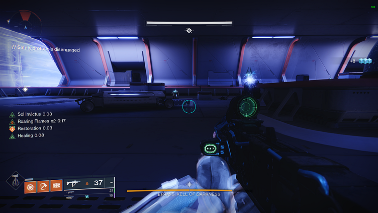
Current Buff UI
Situated on the left hand side of the screen, the buffs show you current statuses of either positive or negative effects against your character. While this UI does a great job being discrete it is limited to four lines. So if you have more than four effects, it does not show them to you until one of them drops off.

Expanded Buff UI
A simple solution to this problem would allow the effects to expand to more than four lines. Another small QoL change would be separating the positive and negative impacting effects. That way the user can see at a moments glance what is good or bad. As we all know, sometimes the fights can be very chaotic (especially during raids).
Minimal Buff UI
Inspired by another popular MMO, a minimal, and icon based UI could really be useful. While this may be geared to veteran players who know what status icons are in relation to the buffs, I believe it could be a great alternative.

Settings Menu UI Update
We cannot forget how a user would enable the different UI options. Situated in the gameplay settings, a simple dropdown could easily be added so the user can select the desired option, Normal (Default), Minimal, or Expanded.


