


Pro-tect Security Logo

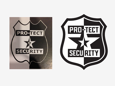
A client has requested an upgrade of a previous brand. The old logo has been around for quite a while so it's kind of recognizable. They don't want to stray too far from the original concept, just update it a little.
So here's my first take, I've maintained the overall structure but have tightened up and modernized the shield, updated the font and increased the size of the double star so that the inner star is about the same size as the original outer star if that makes sense. I felt that it kind of unified the composition.
Any other suggestions from you brilliant minds out there?


