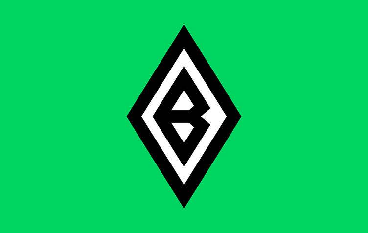
Borussia Mönchengladbach
The new design of the Borussia Mönchengladbach logo is simpler and more minimalistic compared to the previous version. The letter "B" is now shaped like a shield, which is a common symbol used in club logos to evoke a sense of strength and protection. This design element reinforces the idea that Borussia Mönchengladbach is a strong and resilient team.
The changes made to the logo have resulted in a more streamlined and modern design, while still retaining the key elements that make it easily recognizable as representing Borussia Mönchengladbach.
3d
ball
black
borussia
borussia mönchengladbach
branding
bundesliga
bundes liga
design
deutch
football
germany
green
illustration
logo
mönchengladbach
rebrand
redesign
vector
white
View all tags
Posted on
Feb 19, 2023
More by Ensar Sever View profile
Like


