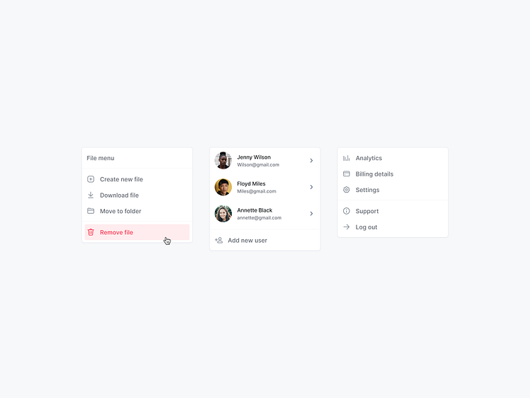
Dropdown | Components
Hey Dribbblers 🏀,
Dropdown menus often get a lot of flak from the UI/UX community, and it is usually with good reason. When done badly, dropdown menus can become ugly and overwhelming.Deciding when to use a dropdown menu or a different interface type such as radio buttons or open text fields can be a bit tricky at times. On an ecommerce website, for example, most users will likely encounter dropdown menus when navigating the checkout flow and probably for a wide variety of inputs.However, large-scale usability testing has shown that using dropdowns for inappropriate input types may actually slow down checkout completion times, as well as lead to potential field validation errors and users unnecessarily devoting their attention to optional fields. All of this ultimately leads to an increase likelihood of users abandoning the checkout process.
Hope you like it and feel free to leave comments and feedback.
Don't forget to press "L" if you enjoy watching this ❤️.
Thanks for checking it out!
If you have comments, let me know!
Say hello at 📧
ux.sergushkin@gmail.com
Visit my Website 🌎
dmitrysergushkin.com
For more inspiration, visit my profiles ✨


