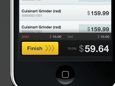
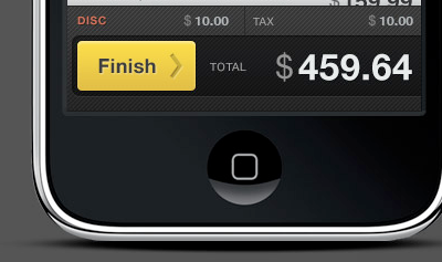
iPhone slide to finish

19 Responses

  1. Pro Matthew Smith Matthew Smith

    I added more grippiness, and increased the row height above too.

    about 3 years ago

  2. Pro Andrew Cornett Andrew Cornett

    Increased button saturation looks nice too. Great work man

    about 3 years ago

  3. Jeremy Swinnen Jeremy Swinnen

    Love it!

    about 3 years ago

  4. David F. Weiss David F. Weiss

    That button is worthy of a finger swipe!

    about 3 years ago

  5. Pro Anthony Dines Anthony Dines

    I'd add a nice animation effect similar to the locked screen, so that the arrows you created animate from left to right with a color shift... I think that'll totally seal the deal to inform the user what they need to do... just a thought.

    about 3 years ago

  6. Pro Lennart Ziburski Lennart Ziburski

    How about some of these "grip-dots" on the left side (maybe two lines) people always use when you can drag an element? I think that would make it look a lot more like a slider than a button.

    about 3 years ago

  7. Pro Mike Meyer Mike Meyer

    I think three grippies at that size may be a bit excessive. Maybe two, or three smaller ones?

    about 3 years ago

  8. Pro Kevin Dees Kevin Dees

    the added arrows really help, love it.

    about 3 years ago

  9. Dave Simon Dave Simon

    I really, really, really want to "Finish" now. And I don't even want two Cuisinarts!

    about 3 years ago

  10. Pro Patrick Haney Patrick Haney

    Love the "slide to finish" idea, and I agree that some grip dots might be in order, just not as many as holder10 has in his rebound (it looks too cluttered, but I like the idea).

    about 3 years ago

  11. Bruno Monteiro Bruno Monteiro

    Awesome detail. Really, really lovely.

    about 3 years ago

  12. Matt Matt

    An exceptionally brilliant idea :)

    about 3 years ago

  13. Ron Lewis Ron Lewis

    Is it me or does the (3) arrows already seem like grippy-ness? The added "grip dots" do seem excessive. Either way nice detail and solid idea. Thumbs up.

    about 3 years ago

  14. Michael Owens Michael Owens

    I like it as is without the "grip dots" as well. None of the Apple slides have grip dots (to my knowledge), so it doesn't feel as "Apple-esque" as it should with them added. I do think that if you changed the ">>>" to the single "Apple Arrow" and/or added the "shifting bright spot" in the text that they use on their sliders it might feel more "Apple-esque" (which may or may not be a good thing, depending on your app).

    about 3 years ago

  15. Kyle Sollenberger Kyle Sollenberger

    Love everything about this - almost.

    Something about using the same pattern on the darker area is buggin' me. Maybe just darken up the the lines a shade or two more to make the pattern more subtle.

    you're still my hero.

    about 3 years ago

  16. Pro Matthew Smith Matthew Smith

    Really great commentary! Thank you.

    I think I want to keep the simplicity of the three arrows, but enhance it with an animation, which I'll work on in the iPhone dev explicitly with the dev team.

    about 3 years ago

  17. Hans van de Bruggen Hans van de Bruggen

    The three arrows make this for me. Though I wonder if the "tray" the slider is sitting in should feel slightly deeper. Good work, regardless.

    about 3 years ago

  18. Pro Ismael Burciaga Ismael Burciaga

    I love everything about the yellow button!

    almost 3 years ago

  19. Pro Pons Creative Group Pons Creative Group

    Great idea to have the primary action item be a slider. Specially since its a very common action for all iPhone users.

    almost 3 years ago

keyboard shortcuts: previous shot next shot L or F like