Minimalistic webdesign for scandinavian housing company skawelg

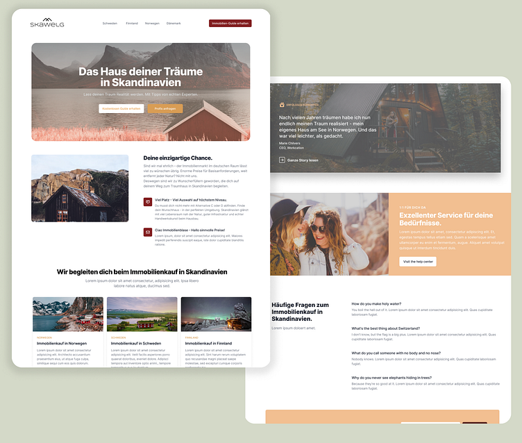
Skawelg is a company that specializes in providing information to Germans, Austrians, and Swiss people who are interested in buying homes in Scandinavia.
For their website design, I aimed to create a minimalistic and Scandinavian look that would not only appeal to the target audience but also emphasize the brand's values of clarity, simplicity, and functionality while staying true to the brands typical scandinavian look and feel.
The design features a clean, uncluttered layout with a lot of white space to create a sense of openness and spaciousness. The typography is simple, with a sans-serif font to give the design a sophisticated and modern feel. The color scheme is mostly neutral, with shades of white, gray, and black, with occasional pops of gold and red to add some personality.
To keep the design minimalistic, we opted for a flat design style, using simple icons and illustrations to communicate information rather than heavy graphics. The website's navigation is also kept simple, with a straightforward menu that allows users to easily find the information they need.
Overall, the design aims to communicate Skawelg's commitment to providing clear and straightforward information to their clients. It conveys a sense of trustworthiness and expertise, with a clean and modern look that appeals to the target audience.
Creating the Branding
Here's how I developed the brand.
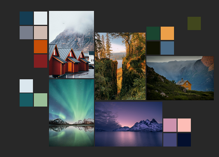
First I went into colors. For that, I created a moodboard with imagery from scandinavia. I picked the colors dominant for each image.
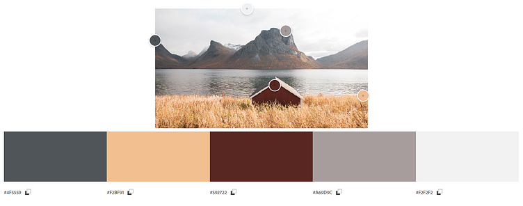
The choice fell onto this picture:
Font + Creating Icons
The font was quick to be found. Next up: Icons.
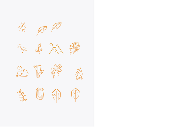
Keeping the icons minimalistic with a handmade touch, they just fit the brand perfectly.


