Your shopping cart has been updated

Launchbarscreensnapz001

20 Responses

  1. Pro Veerle Pieters Veerle Pieters

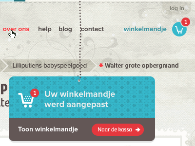
    When a user adds an item in his/her shopping cart, you'll get this message (your shopping cart has been updated). I'm not doing the CSS/HTML for this site, but I was thinking of using a fun CSS3 animation: having it fall down from the top, with a subtle bouncing effect at the end.

    likes

    almost 2 years ago

  2. Pro Emir Ayouni Emir Ayouni

    Sounds like a pretty cool idea.

    And the design looks top notch.

    almost 2 years ago

  3. Pro Olivier Vanbiervliet Olivier Vanbiervliet

    Lovely design & colors. A bounce effect would really nail this.

    I'm just a bit overwhelmed with the patterns & textures. I love the stars on the bluish card, and also the background, but together with the transparent breadcrumb and the pearl line for that blue card it looks a bit busy.
    Maybe it just looks busy here in the 400x300 and perhaps less in the full site?

    almost 2 years ago

  4. Pro Eric Miller Eric Miller

    Veerle, very cool idea. Something about the chain is a bit off... I get in in concept, but perhaps the dots need to be a bit closer together.

    Really like the "1" in the cart circle... what will you do over 9? Maybe a "9+"?

    almost 2 years ago

  5. Pro Veerle Pieters Veerle Pieters

    Thanks for the feedback guys ;)

    @oVan, yes it could be because of the small fragment indeed. Though the design is full of these elements to have a cuteness overload effect :)

    @Eric Miller I might try moving them a bit closer, or add a line or something (a cord) to ties the dots together maybe. On the remark about the number of items: I'll expand the the circle (probably centered out) into a rounded button, with complete roundness on left and right ends, if you know what I mean.

    likes

    almost 2 years ago

  6. Pro Shane Helm Shane Helm

    Love the patterns!

    likes

    almost 2 years ago

  7. Pro musHo musHo

    Isnt it a little bit dirty? :-/
    (with the all respect, big fan of your work Veerle)

    almost 2 years ago

  8. Pro Callum Chapman Callum Chapman

    Really really nice! Love the texture, and brilliant use of colours too! :)

    almost 2 years ago

  9. Pro Eric Miller Eric Miller

    @Veerle Know exactly what you mean on the #'s... on the chain, I think what is cool about it is that it represents that kind of chain that is made up of the "bulbs" without the cord, so try not to lose that :)

    almost 2 years ago

  10. Marko Prljic Marko Prljic

    Don't bounce. Imagine I click 3,4,6 items one after another.

    almost 2 years ago

  11. Pro Kris de Jong Kris de Jong

    Love the shopping cart! Nice work

    almost 2 years ago

  12. Milan van Bruggen Milan van Bruggen

    Hey Veerle. Great design! Is the message meant to be formal? I would expect a more informal tone-of-voice. By the way, I love the color palette!

    almost 2 years ago

  13. Pro Veerle Pieters Veerle Pieters

    @musHo The way the background looks now, its color, the subtle textures and other elements, is just perfect in my opinion. It makes the bright colors shine even more, and it also creates a good balance between the two, which makes a perfect contrast too e.g. to attract attention to where it needs be.

    @Eric Miller I've used a very tin cord and it looks really nice I think, so thx for bringing this up.

    @Marko Prljic well, actually that's impossible to do, because you need to be on a product detail page to be able to add an item. You can't add it on a product list page. It's set up this way because people need to see the product details before they can buy it. This is to avoid misunderstandings and trouble afterwards, because e.g. sometimes the product photos are shown in a certain way to make it more attractive (e.g. other things are added to make it complete), and so the user needs to see what's included and what's not.

    likes

    almost 2 years ago

  14. Marko Prljic Marko Prljic

    Oh well then, you planed it right ;)

    almost 2 years ago

  15. Pro Derek Lauritzen Derek Lauritzen

    Love this idea & the design is flawless!

    almost 2 years ago

  16. Pro Andrew Korytsev Andrew Korytsev

    So cute!

    almost 2 years ago

  17. Pro Mike Bronka Mike Bronka

    What is the font name used on this project?

    almost 2 years ago

  18. Pro Olivier Vanbiervliet Olivier Vanbiervliet

    @Mike: proxima nova & bree, you can see it in the tags.

    almost 2 years ago

  19. Pro Mike Bronka Mike Bronka

    @Olivier: point.

    almost 2 years ago

  20. Pro Matthias Deckx Matthias Deckx

    Love these! And your speech at Multi-Mania was quite inspiring!

    12 months ago

keyboard shortcuts: previous shot next shot L or F like