Concept restyling FC Shinnik

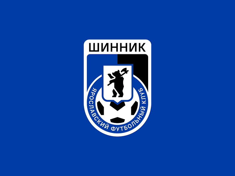
Football club Shinnik is one of the main sports brands of Yaroslavl.
Our studio proposed the idea to simplify the club logo but the project was not implemented. We decided that it deserves to be presented.
The bear is one of the key elements of the logo. In the new version the system of angles makes it possible to execute it in the geometry of the sign. Extra strokes have been removed, and the text has become more sparse. The design has consistently evolved from a simple "wheel" to an emblem with the region’s coat of arms.
Shinnik logo design gives a wide space to work with souvenir products and merchendise.
Find out more: https://quberten.com/concept-restyling-fcshinnik


