Motlow State Athletics | Brand Identity

Motlow State Athletics | Brand Identity
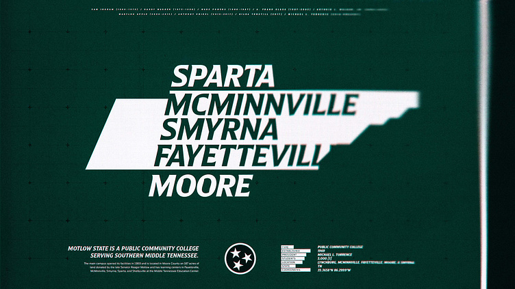
Since it opened in September 1969, Motlow State, a public college serving southern middle Tennessee, has held the goal of changing lives through education, partnerships, and its community. To mark the recent 50-year milestone of education, instruction, and growth, I worked with Motlow to refresh their athletics brand identity to more authentically and powerfully reflect the spirit of the institution, their values, community, and determination of the athletes as they open a new chapter looking forward to the years ahead.
ROLE Creative Direction + Design Lead
SERVICES Brand Identity, Typeface Design, Illustration
MOTLOW TEAM
Kyle Henn | Internal Designer / PM
Terri Bryson | VP External Affairs
LINKS
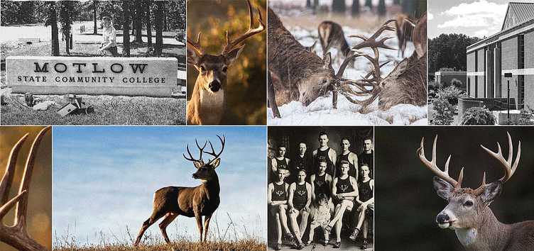
Research & Strategy
Before pencil hit paper, Motlow’s Branding Thought Partners, a collective of Motlow’s leadership, conducted public surveys, facilitated focus groups, and consulted over 2,000 community members to better understand what the perception of their brand was, what elements of the brand were important, and what parts held little affection.
With an agreed consensus that a brand refresh was the best path forward, Motlow leadership and I defined in more concrete terms what the most promising directions for design exploration were through guided dialogue and curated reference boards.
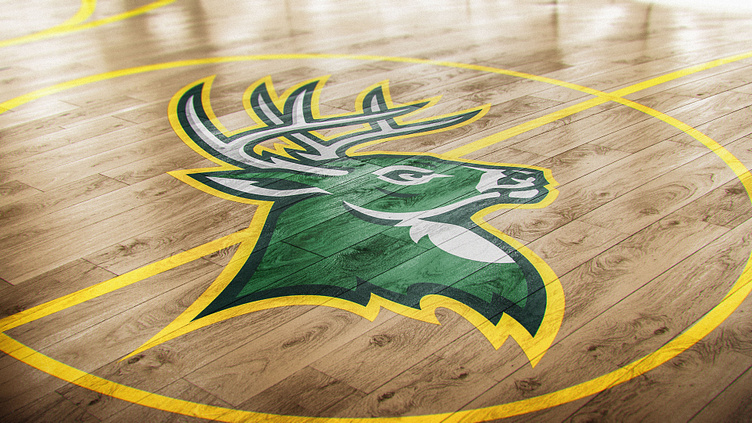
Stakeholder and community research surfaced an affinity for a balance of traditional and modern styles.

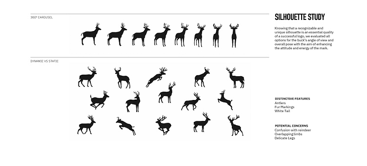
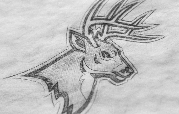
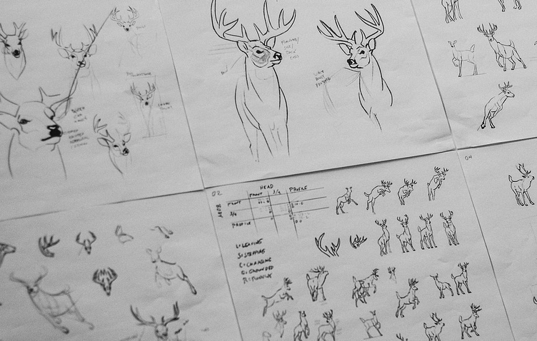

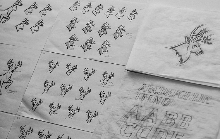
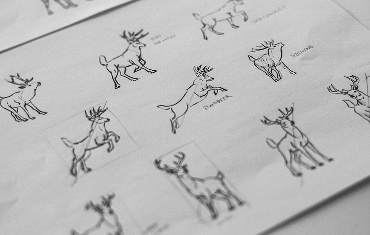
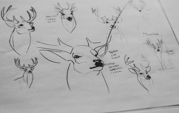


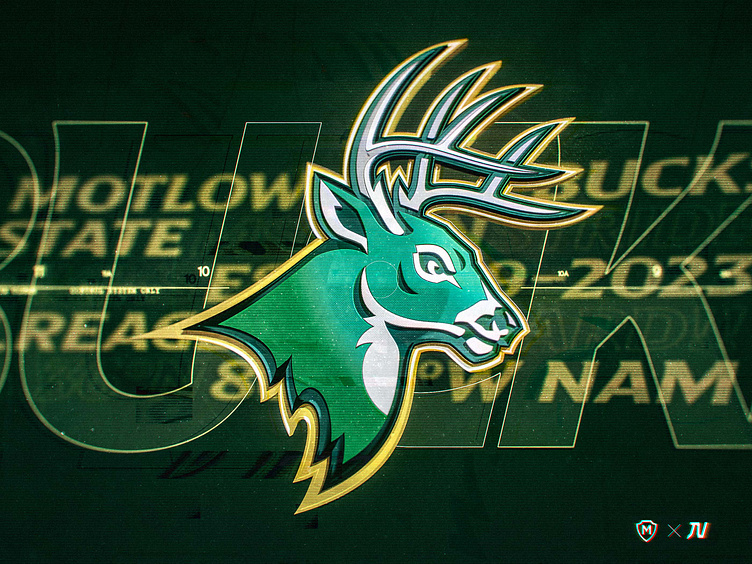
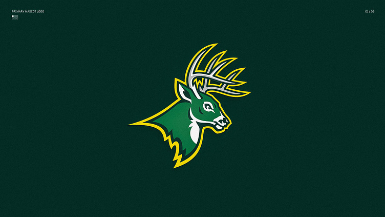
“Early on, we had to decide if we wanted a forward-facing buck, a side-facing buck, or a three-quarter pose. The attention to detail and the iterative design process of the collaborative effort helped us see the criticality of small changes in poses, eye shape, and the presentation of the antlers. It all came together wonderfully.”
— Dan McShea Motlow Athletic Director

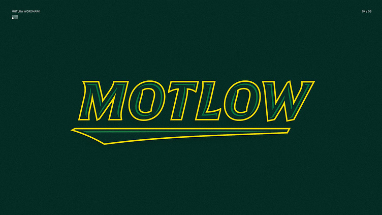
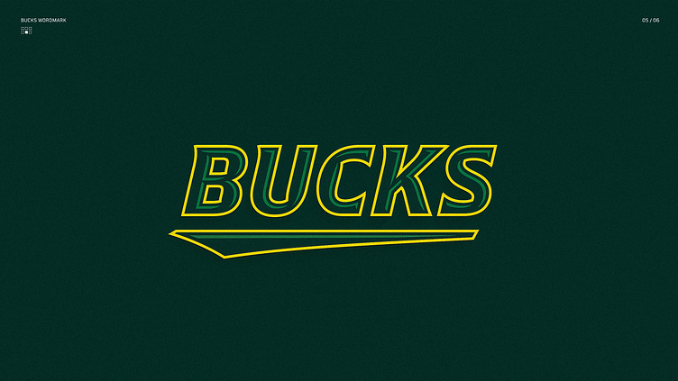
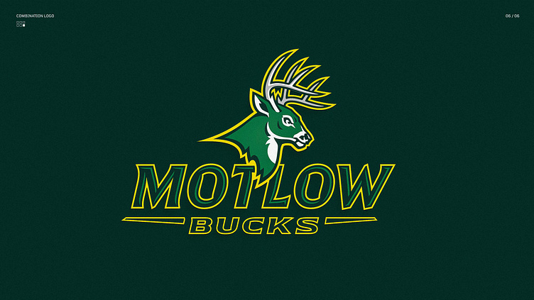
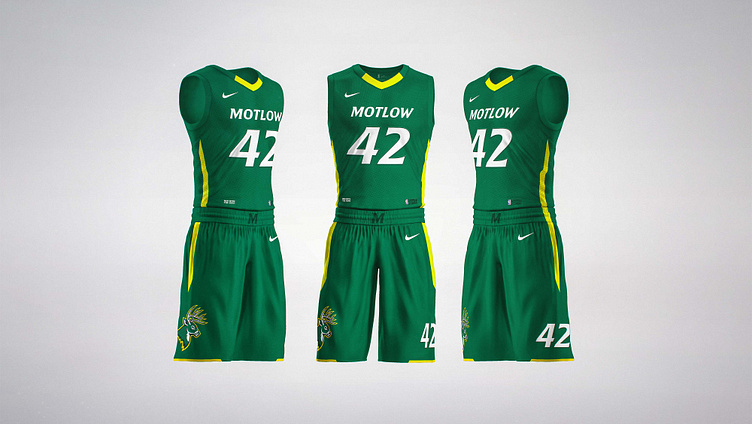
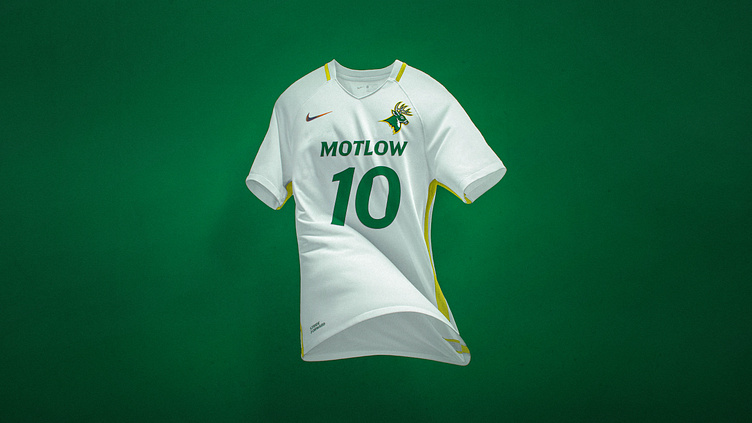
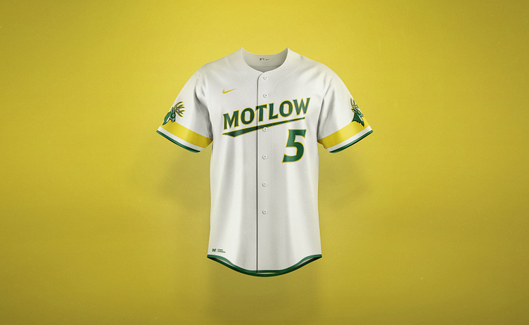
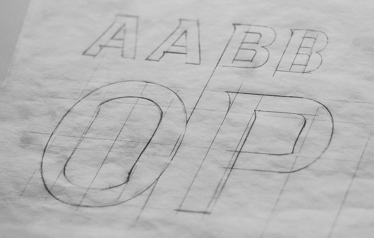
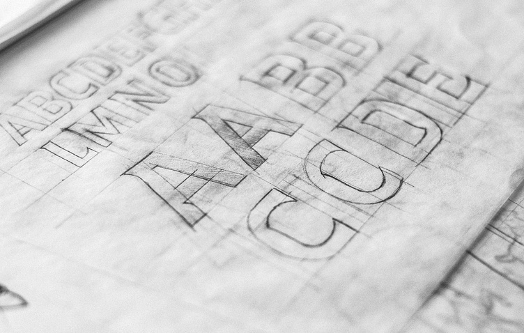
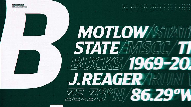
Reagor | Custom Display Typeface
Reagor is an All-Caps display typeface drawn for headlines, eye-catching graphics, and branded messaging. Mimicking the smooth curves and tapering points found on the mascot logo, Reagor visually compliments the logo's features to help solidify the brand's visual voice. Flared serifs, a thirteen-degree italic angle, and inflected interior corners balance distinctive features but still express energetic forward momentum.
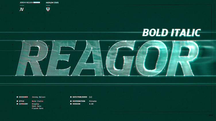

“While we needed an updated Buck image, we also wanted a custom font that was strong, unique, and would help build our brand. Something that will make our fans proud to wear the brand and be a Buck.”
— Dan McShea Motlow Athletic Director