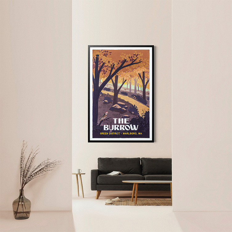
The Burrow

Earlier this year I was commissioned by a property development firm to illustrate a landscape poster design for a new apartment complex they were launching in the Boston metro area.
The inspiration was rooted in 1930s national parks posters, which is a common motif in my work. They wanted to create an aspirational view of the property, which features lots of foliage and walking trails as its main point of focus.
Sketches
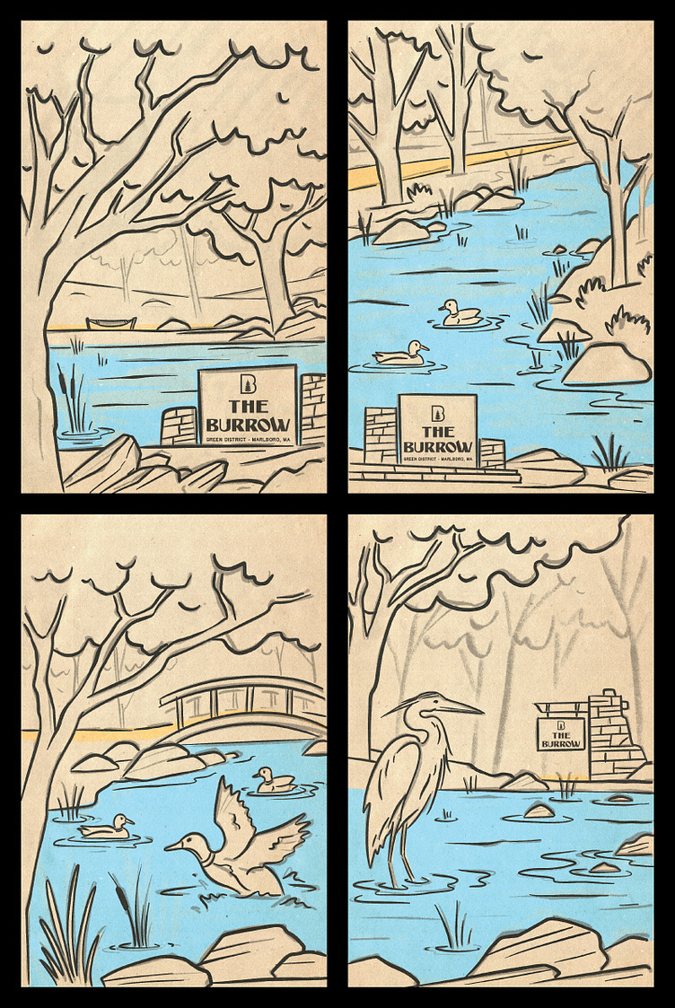
As we got the project going I just started trying a few different things to see what resonated with the client
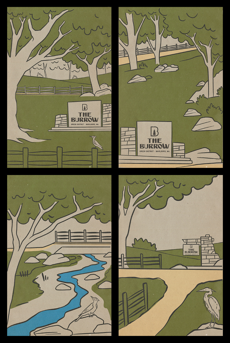
These sketches focused more on the trail system and less on water features. This was heading in the right direction for the client.
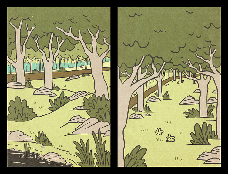
From there I dialed up the density of foliage

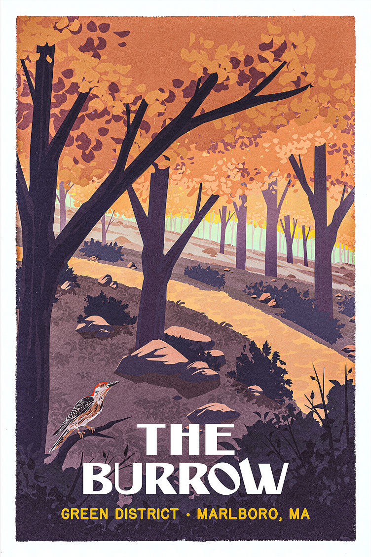
The composition shown here on the left is what ended up getting final approval and would then lead to the finished artwork seen on the right.
Full Fidelity Artwork
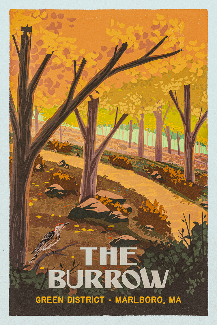
Here was the first pass on finished artwork. The client was a big fan, but wanted to see some reduction in detail and some changes to the color palette.
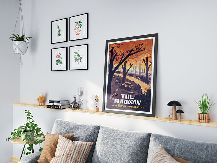
In the final draft (seen at the top of this case study), we dialed back the ground cover and some foliage detail and cooled down the colors on the fore and midground images a good bit.
The Hero Image
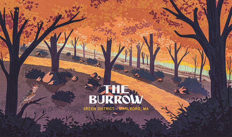
The client then requested that we create a wide version of the artwork for use in website layouts. So I went to work on extending the composition for that wider aspect ratio.
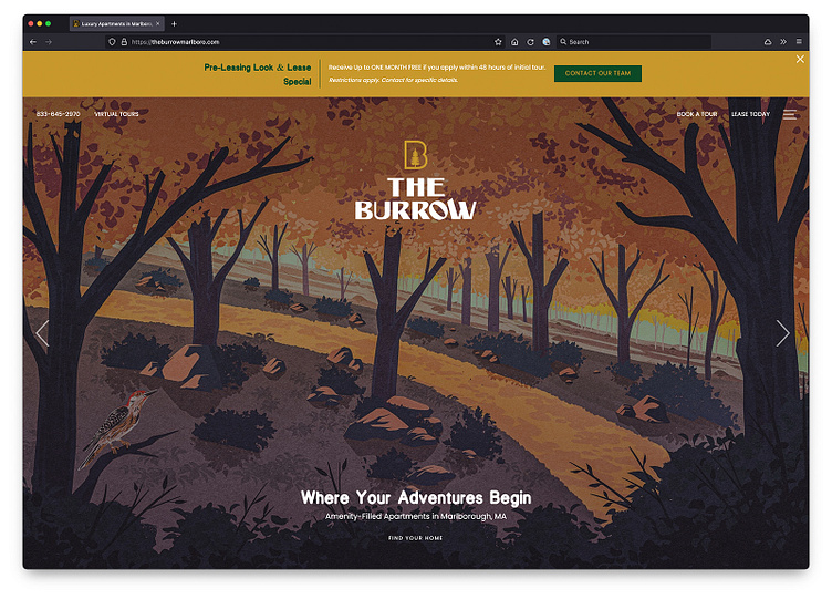
And here above you can see that wide version in use on their website