Merchande Font Family Presentation Images

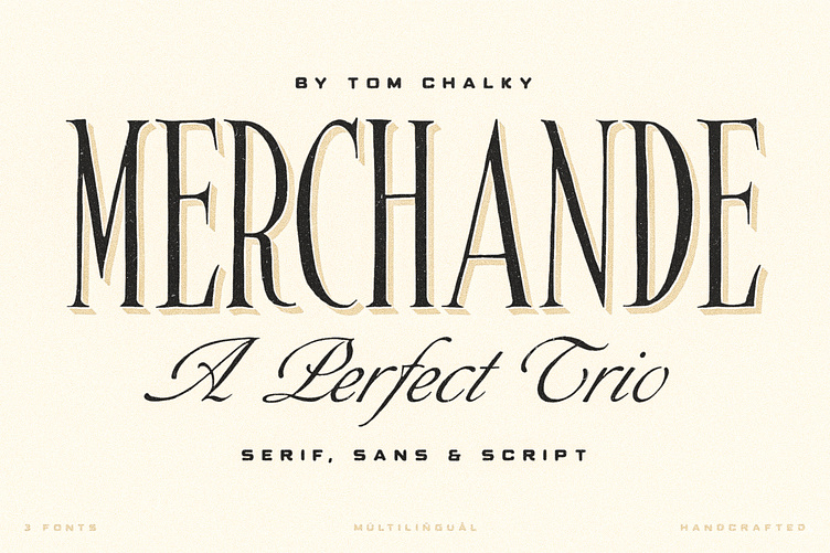
Introducing the 'Merchande' Font Trio
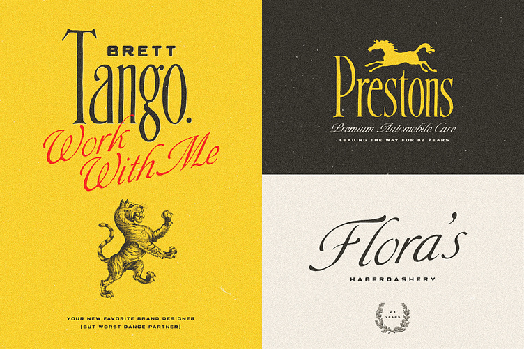
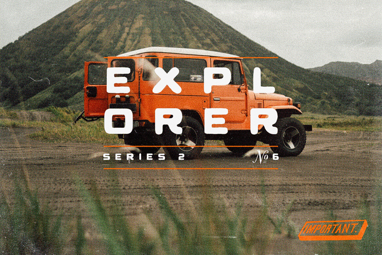
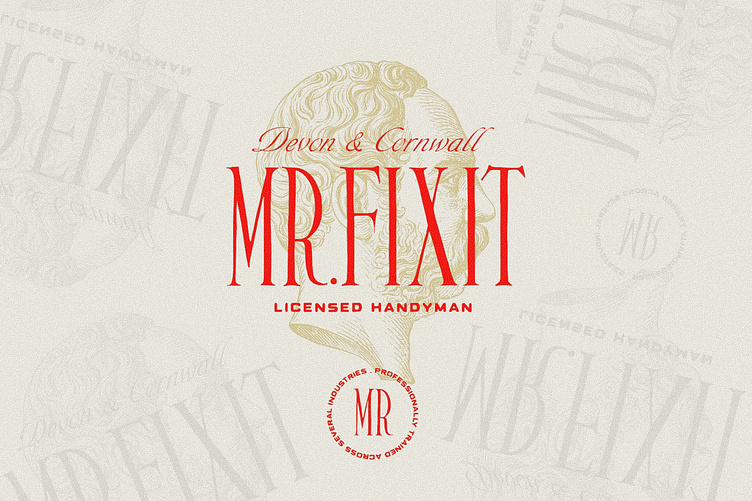
Inspired by various midcentury typefaces, the Merchande trio was designed to add pizzazz to your branding, packaging, advertising, and print projects.
What's Inside?
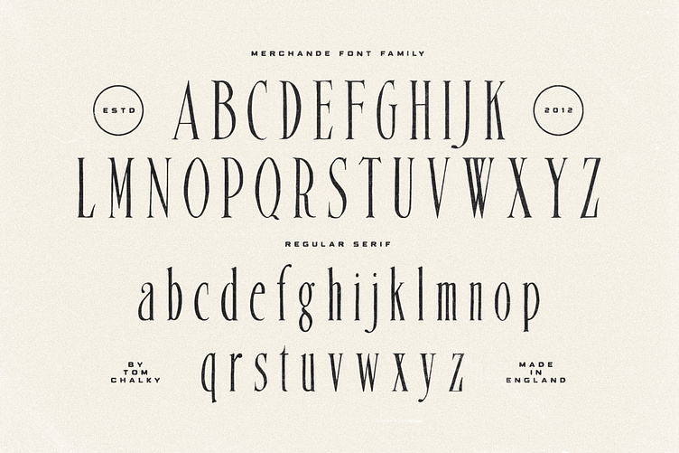
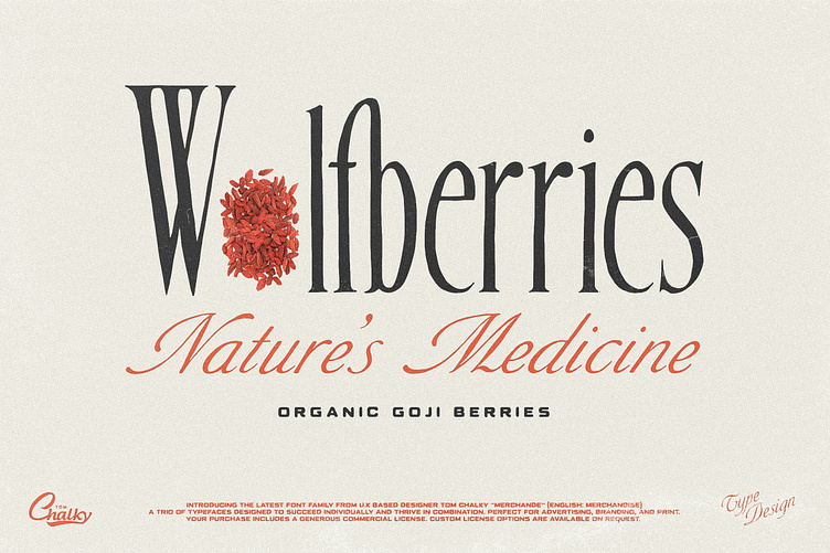
The serif is fantastic for headlines, logos, and anything that needs to grab attention. Its tall, condensed, and confident appearance is a great head-turner, made even better when combined with the two below.
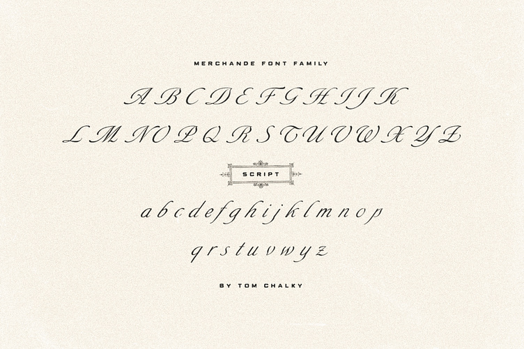
The script is perfect when a premium touch is needed for your work. Its use immediately adds a charming, personal quality. The best part, it's wonderfully legible in any size.
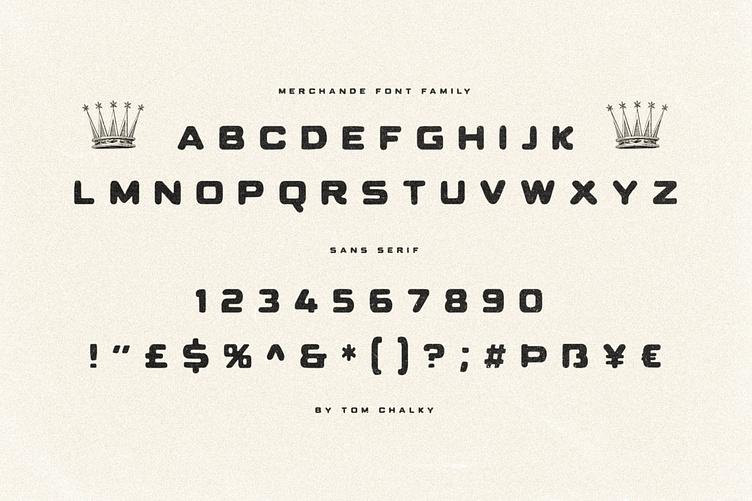
While the sans works fantastic as a large display font, it truly shines when used for its intended purpose. Small text. Evidence of this is scattered throughout the presentation images. Tip: Increase the space between the letters (tracking), it looks awesome.
The three fonts are multilingual, supporting the Latin 1 glyph range (primarily Western European languages)