Redesign Project for a non-profit organization

Central Square Foundation
URL: https://www.centralsquarefoundation.org/
Redesigning a non-profit website
Timeline: 2 Months
UX Technique Applied: User Interviews, Research, Competitive Analysis, Card sorting, User Flows, Siteh Map, Sketching, Wireframing, Usability Testing.
The Problem CSF requested a redesign of their website for two main reasons:
Understandability: It was content heavy, slow to load.
Information Architecture was broken
Website felt too content heavy.
My Initial insights after interviewing the Stakeholders:
1) Improve peoples’ understanding and awareness surrounding the impact of What CSF does. 2) Increase contributions, subscriptions & better readability on existing programs.
The Solution I re-designed the current website to provide individuals with more meaningful information, highlight their main mission and programs, and easy ways to contribute, read up on past work and on-going programs too. This would help increase awareness about their organisation as a whole.
User Research To gain a better understanding I conducted a series of user interviews and surveys. Questions we asked included: 1)Why do you want to redesign the website?
2)What kind of information do you want people to get from your website?
3)What major factors do you want to highlight and why?
4)What other organizations do you want to be involved with?
Target Audience:
1) Potential donors who are curious about education of children in India, want to contribute, but are unsure where to start or how they can make an impact.
2) Job seekers, volunteers, partners.
Existing site analysis:
I identified several issues that might discourage an individual from getting involved including: Too much scattered information about the issues A confusing site navigation process
Delayed load time
Aspect ratio issues for mobile sites due to unresponsive templates.
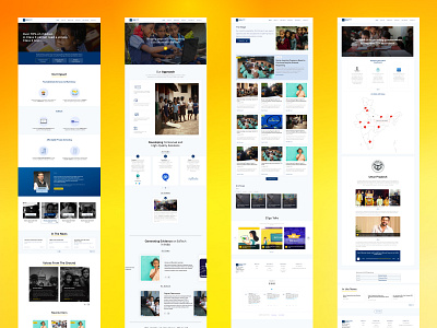
Wireframing After I defined the core functionalities that were needed to include in the website, I created quick, low-fidelity, wireframes. Using these wireframes, I conducted usability testing within the CSF team. This allowed me to gather some crucial feedback to help decide what to include in the final visuals.
Design The main reason to redesign was leading users to ways they can get the most relevant information. In order to immediately catch the attention of our users, I designed a Subscribe button as the main call to action on top of the page, further highlighted by the blue color. The color palette was predefined by the organization.
Since the information was too much, I did card sorting and compartmentalized the pages in such a way that each page would only have specific information. For e.g.: Separate pages for FLN, EDTECH, ECE, Private Schools, Video gallery, Reposts, Blogs, etc.
Since there was a lot to communicate, I kept the UI fairly simple using shades of whites & greys & also reflected the personality of the brand in order to stand out from the competition and provide users with a delightful easy to navigate experience.


