Re-thinking the apartment search experience

RentCafe delivers the safest apartment search experience on the web. All apartment listings are 100% verified, are directly from top property managers, pricing and availability updated daily, and your information immediately delivered to the property you’re interested in.
Finding the right apartment is already a tedious and exhausting process, that involves making some deeply personal choices. How could we create a faster, simpler, more human-centric search experience, that delivers highly personalised results, helping people find exactly the right apartment.
My contribution: discovery, interaction design, interface design, testing
The Problem
The apartment search process was cumbersome, impersonal and took a lot of tweaking of the parameters to get to the right results. Users were abandoning the search process without registering/logging in to contact or save any properties to their favorites.
Our vision: a straightforward, easy-to-use search experience that delivers
ultra-personalized results
Research
An extensive analysis of apartment search engines showed us that we were lagging behind in several aspects. We were playing catch up. As a result, in many cases users were applying for apartment rentals through our competitors, even when starting their search on RentCafe.
Through user interviews and surveys, it became evident that there were significant pain points in the process of finding their ideal apartment.
1. slow or difficult to use/unintuitive filtering options
2. time consuming process of finding highly relevant search results
3. no ability to easily manage and organise listings into categories (liked/disliked/contacted)
Opportunity
Not only was this project important because it was one of the top pain points we continued to hear from customers, but it also added significant value to the business.
We saw a highly personalized search experience as a way of making it easier to find relevant listings, increase likelihood of applying to rent, to encourage users to register/log in and to satisfy market demand.
Our opportunity was clear: we could become the default go-to place for people looking to rent an apartment, fast.
Iterative exploration
Initially we have defined the user flow and broken it down into 3 segments: questionnaire, search results and feedback/organization.
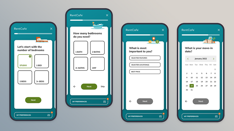
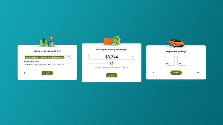
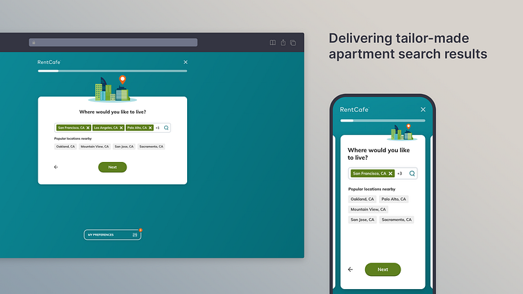
1. Questionnaire
explored several card designs to accommodate different types of questions, while keeping consistency.
added preferences button so parameters can be updated at any step of the process, keeping users in control at all times
early user testing made it clear that it’s not easily understood which questions are optional, so we’ve added a “Skip” option
experimented with formulating the questions, making the final iteration straightforward and easy to understand
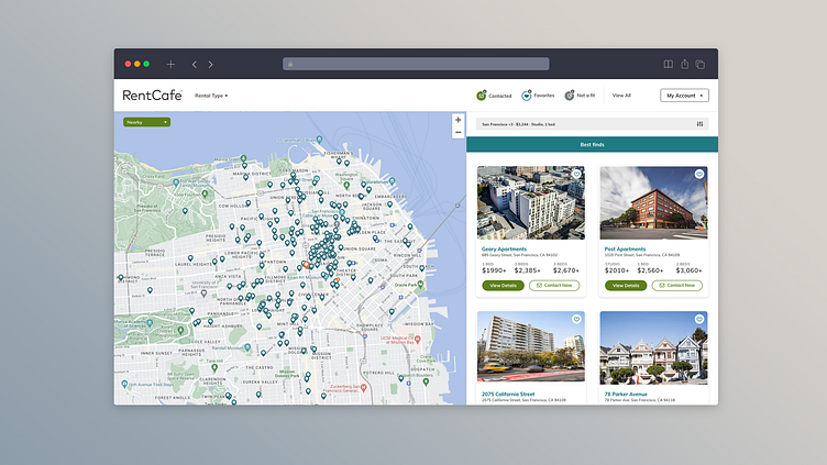
2. Search results
results are based on answers from questionnaire with special weight to the answer “what is the most important to you?”, listing the best matches first, then continuing with options which are somewhat lacking in one key aspect (either location, price or amenities)
retained the possibility for users to modify/update their initial answers, generating a new list of results
3. Feedback/organization
explored different variations of a straightforward interface for users to quickly categorize listings one by one by either signalling that it’s not a fit or adding it to their favorites.
alternatively they could signal their interest in the listing by sending their contact info to the property manager by the click of a button.
Outcome
less people abandoning the search process
more than doubled the average number of contacted listings per search
increased number of successful rental applications
significant increase in new user registrations compared to previous quarter


