Head To Toe logo design project

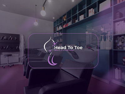
The logo consist of three elements
1) a Lady's illustration which symbolizes mainly what the Brand does that is hairstyling, makeup and their beautification stuffs
2) the circular or oval shape which also serves as the lady's head and this symbolizes two things firstly, it symbolizes A-Z which is used as top to bottom, beginning to end, 100% (complete) or head to toe the Brand name
Secondly the shape symbolizes satisfaction which should be one primary thing the brand should be after
Satisfaction in the sense that when you are satisfied with their service, you will return there over and over again infant, your returning will be a continual one (repeated over and over again) and that's why the lines are cycling round.
3) is the shining or twinkling stars which symbolizes the end result of beautification which is being attractive, glowing, and the likes.
And also it symbolizes quality (the star) both in services and product (they sell)
Link to project: https://www.behance.net/gallery/162284891/Head-To-Toe-Branding-Project


