Case Study | Dog Walking App: Dog Space


Dog Space: Helping owners connect with trustworthy dog walkers to help care for and walk their dogs.
Design Brief
The dog walking app was completed as a part of Dribbble’s Product Design Course. Our group was given a project brief, weekly check-ins, and brainstorming sessions, but the result was up to us. Here is my work on this project.
Problem
Dog owners sometimes need help caring for and walking their dogs.
Solution
Create a service to connect dog owners with dog walkers.
Duration
8 weeks.
Role
Product designer. From research to testing of the final project.
Research
Challenge - Consider how we can help dog owners trust their dogs are in safe hands.
Project Goals
Business
Earn % of every booking
Dog Owner
Find a trustworthy dog walker
Dog walker
Wanting to have income based on service
Then was an ideation phase. In the process of work, interviews were conducted with different people, a portrait of the UX person was drawn up, and based on these data, an affinity diagram was compiled. Through affinity diagram were identified the following pain points as a major factor for dog owners:

After reviewing competitors' applications, I concluded that most of them do not have straightforward onboarding and overwhelming app UI.
To solve these problems, I came up with the following solution:
Create a simple application:
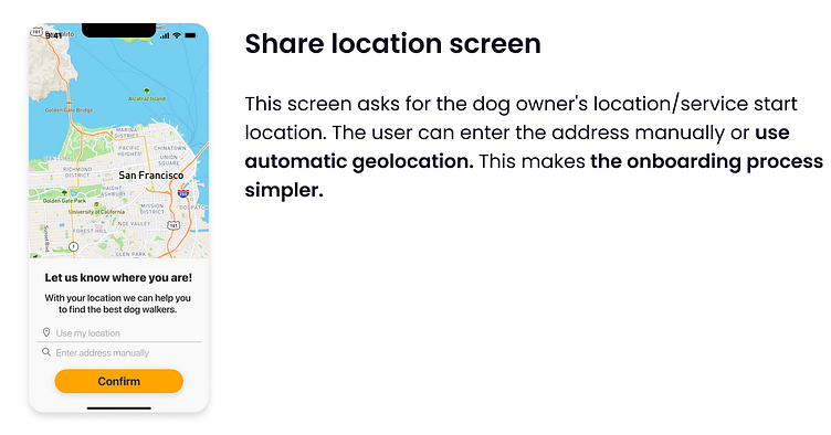
the user can start the process of getting to know the application and booking a walk without registration
the application only asks the user for a phone number and address, which can be determined automatically
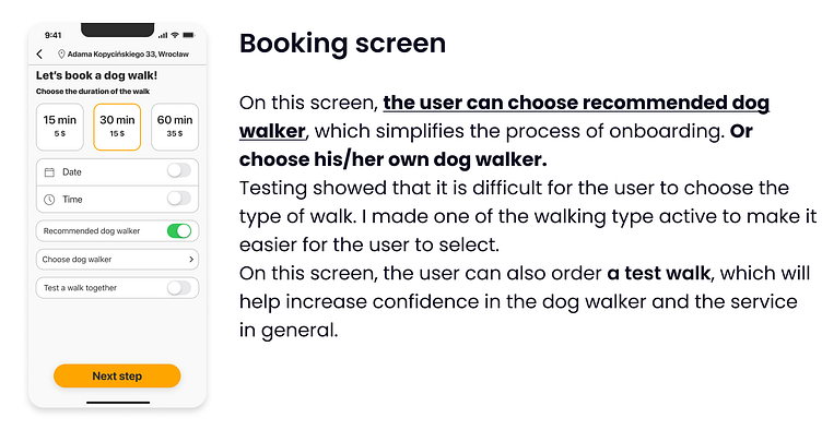
the application suggests the most optimal time for a walk
the application suggests the best dog walker for user request
These decisions helped make the first onboarding process simple and with a minimum of user decisions.
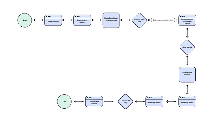
User Flow
The next step was to create a user flow. I tried to make the user flow linear and as simple as possible, considering my conclusions after user and market research.
Wireframes
After creating the user flow, I started creating wireframes. There were two versions of wireframes. In the second version, I reduced the number of screens and the number of user decisions as much as possible.

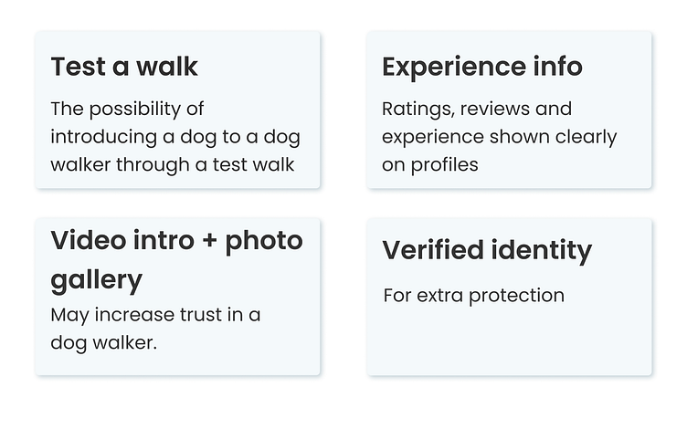
In the process of creating wireframes, I tried to close the pain points of users with the following means:
Visual Design
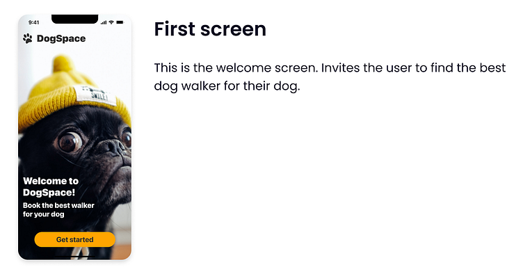
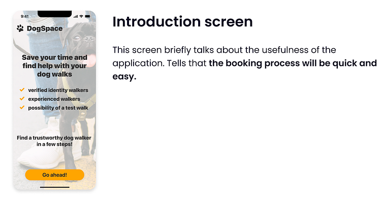
From there, I moved to visual design. I created screens for the first onboarding from entering the applications to the service order. I tried to make the process as simple as possible and bring the user to the order of the service.

Prototype + Test
The final stage was prototyping and testing the application on real users.
Task: “Book a dog walk for December 10 at 9 AM”.
How prototyping and testing were useful for me?
explain to the user the idea of the service;
сheck what information the user sees;
evaluate what the user looks and feels.
The main: showed the weak points of the application and what needs to be improved so as not to lose the user.
The next step is to test the application on more people and highlight the weaknesses. Creating an awesome user experience is the end goal of the digital product. But getting to awesome takes a lot of trial and error.
It was a great learning experience, and a cool first project to try out product design. Product design by nature is all about learning and growth. So just go ahead!


