Poster Type Sneak (in progress)

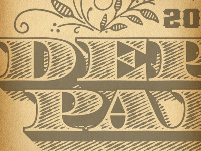
Current project in progress -- a commemorative poster shooting for an 1890's meets 1920's mashup aesthetic. I usually like to get something a little warm, starting to cook with the type before I start illustrating, then I come back and alternate, refining the type to suit, and vice versa. And I always design in black & white, high contrast first. It's an old habit from print design to build up from 1-color, but I find it serves me well for just about any type work, because it forces you to see pure weight and form before any color is considered.


