Community Governance Portal - Dapp

Since I am an active member of the Eco community, I decided to make a concept
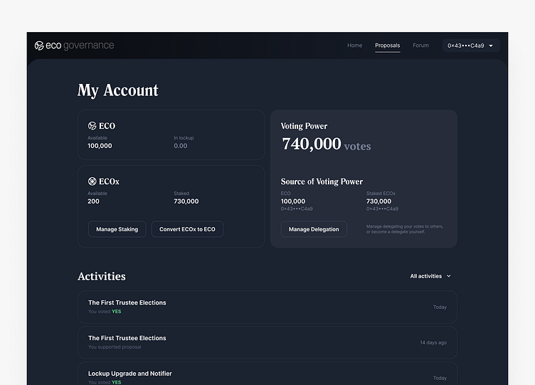
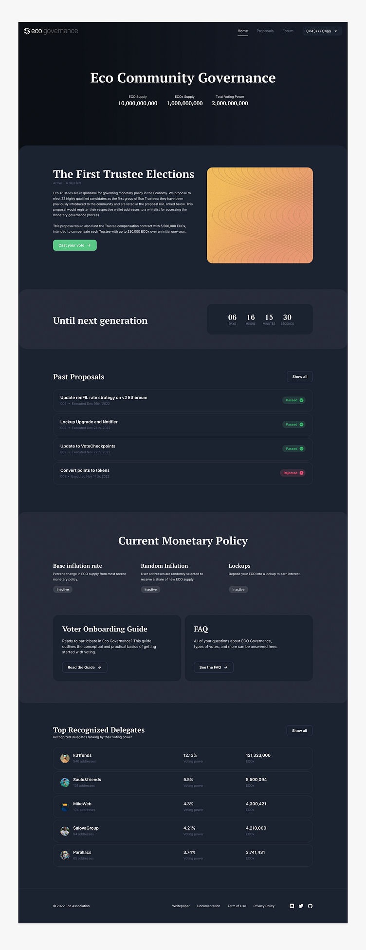
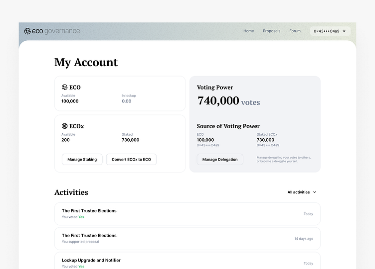
for the user interface of a decentralized application (Dapp) focused on community governance. The App aimed to provide a platform for decentralized decision-making, where community members could propose and vote on proposals that could impact the project's direction.
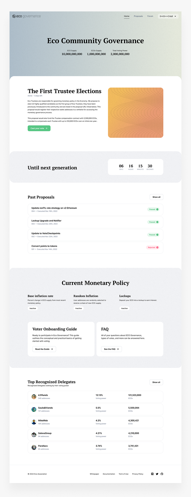
As part of the visual design process, I incorporated some styles from eco.org to ensure that the App's design was aligned with brand principles. This included using a color palette and typography that reflected Eco brand identity.
Here are some additional details on how the redesign specifically aimed to improve the voting process:
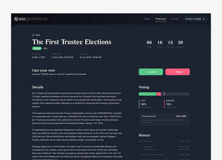
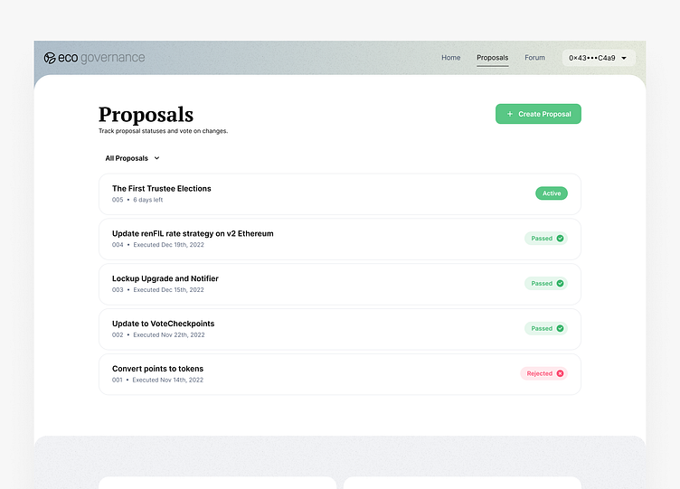
Clear proposal details. The proposal page was designed to provide clear and concise details about each proposal, including the proposal text, voting options, and any relevant attachments or links. This helps users make informed decisions about how to vote and understand the impact of their vote.
Voting outcomes. After a proposal has been voted on, the Dapp displays the voting outcomes in an easy-to-read format. This includes the number of votes for each option, as well as the percentage of total votes. This makes it easy for users to understand the outcome of the vote and see how their vote contributed to the final result.
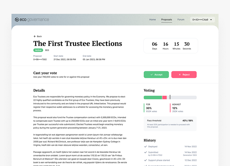
Dark mode. The redesigned Dapp includes a dark mode option that is easy on the eyes and reduces eye strain. This is especially important for users who spend a lot of time on the platform and want to reduce the amount of blue light exposure. The dark mode is also consistent with modern design trends and can make the Dapp more appealing to users who prefer a darker interface.