Chapman & Wright Logo

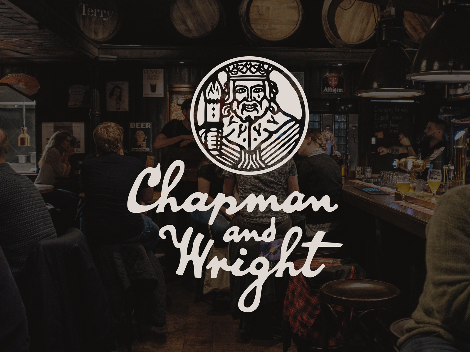
I was wandering through a used book store and found an old clip art book from the 80s- one of those old royalty-free paper backs. Flipping through it got me thinking about old businesses that re-brand while keeping their old charm. So, Chapman & Wright is my take on an old tavern that had rebranded but kept it's old-style type and mark. I wanted the logo to have the feeling of having been created by hand. The king logo was inspired by one of the drawings from the clip art book.


