Who said email should be boring?


Project overview
This project started out as a capstone project while participating in the Dribbble Product Design course. However, as I progressed and continued to work on it, it turned into a deeper exploration of how to re-invent email and bring it into the modern age making it more appealing to a younger audience.
Project brief
For this project, I was working based on a fictitious persona who uses email a lot for her business and who was not at all happy with existing email solutions. More details on this persona can be found further down this case study.
The original assignment was to create several user flows followed by some wireframes to go with those user flows. I ended up designing several actual screens for the email application and a prototype displaying several vital features.
My role in this project
My role in this project was initially that of a UX designer working out the user flows and constructing several wireframes. I also extended that role to UI design by working on designs for several screens for the application.
Understanding the user
Initial user research
Initial user research was performed before my involvement in this project and led to the creation of the following persona:

User flows
Once we had the persona defined, I started working on the following user flows:
Threaded chat-style email view
Canned responses
AI-driven suggestive text
Better handling of unwanted emails and newsletters
The Figma file for these user flows can be viewed here.
Ideation and wireframing
I started out doing some very rough sketches, the first ones are for the application inbox, and the second ones are for the message/conversation interface.
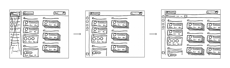

After these initial hand-drawn sketches, I switched over to Figma for some digital low-fidelity wireframes.

After doing some basic user testing with friends, family, and colleagues, I moved on to high fidelity mockups in Figma:
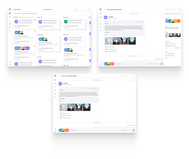
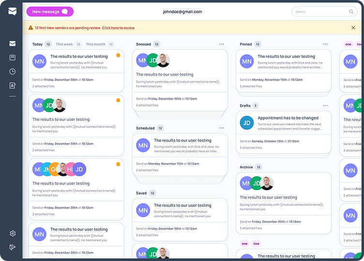
Designing the interface
I then started doing some design work by putting screens for the inbox/dashboard and conversation interface together while making sure the actual user always remained front and center.
By far the most time was spent working on the inbox, as I experimented a lot with different layouts. My goal was to stay away from the conventional email application interfaces (three column layout and emails laid out vertically).
I ended up using stacks of emails for different folders. Users can easily move through a stack or un-stack to quickly see everything in that specific stack.
Inbox/dashboard
Conversation, with sidebar and collapsed composer
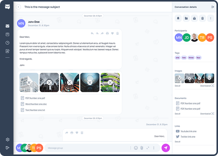
Conversation, with sidebar and expanded composer

Prototyping
Once I had these screens designed I spend a good amount of time putting everything together in a working prototype using Figma's prototyping functionality. The prototype can be explored online here.
Below you'll see a recording of the prototype in action.
Takeaways and next steps
There are still a good number of UX challenges that would need to be solved and interfaces to be built before this could be turned into a fully functional email application:
Advanced reply functionality inherent to email which does not easily translate to a chat-style structure (reply to all, reply to specific recipients).
Large conversations with multiple participants could be rather difficult to fit into a chat-style conversation layout.
The user experience around filtering incoming messages, especially from senders with whom the user hasn't interacted before.


