Geffen - Sketching & Concept

Geffen Solutions creates Digital Transformation for the Common Good, empowering their customers with digital strategy, technology and service innovations that deliver messaging, interfaces, stability, agility and freedom through exceptional experiences.
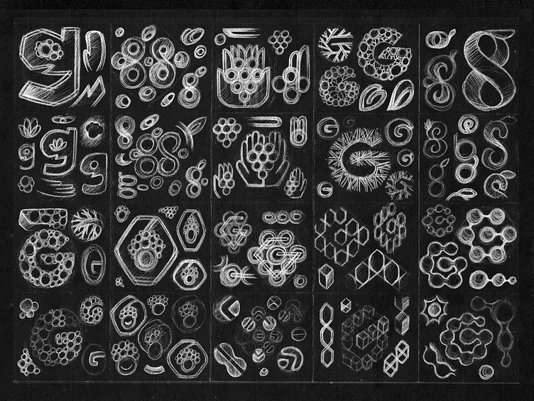
Geffen (Hebrew: גֶּפֶן, lit. Grapevine) is a Hebrew surname, so I tried here to explore the vine imagery with the idea of collective, transformation and connection with some use of it's initials (G+S).
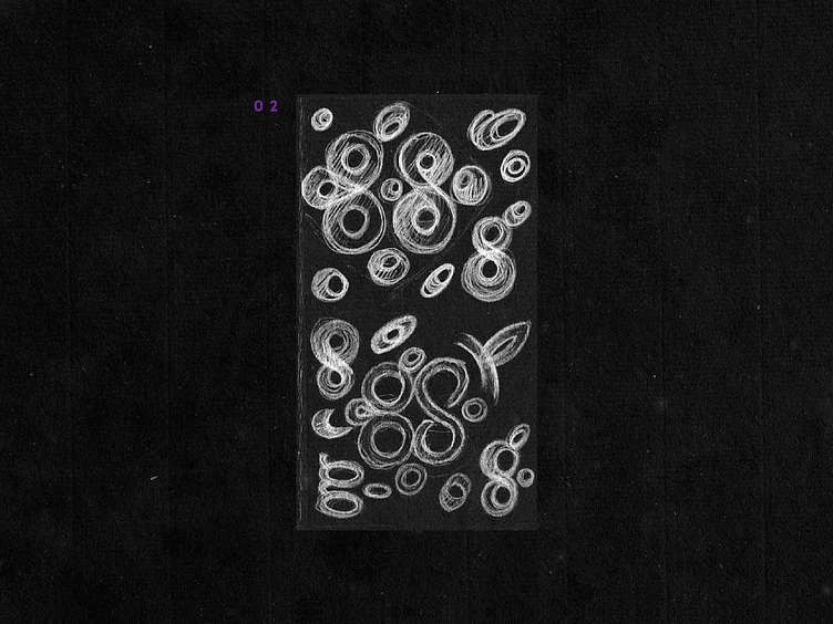
✦ Here I tried to explore the Negative Space inside the G letter to convey a hand gesture of "giving" or helping with some king of substance or material (in this case I was looking for a couple of grape berries, or leaves, etc.
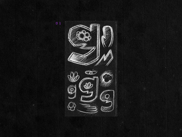
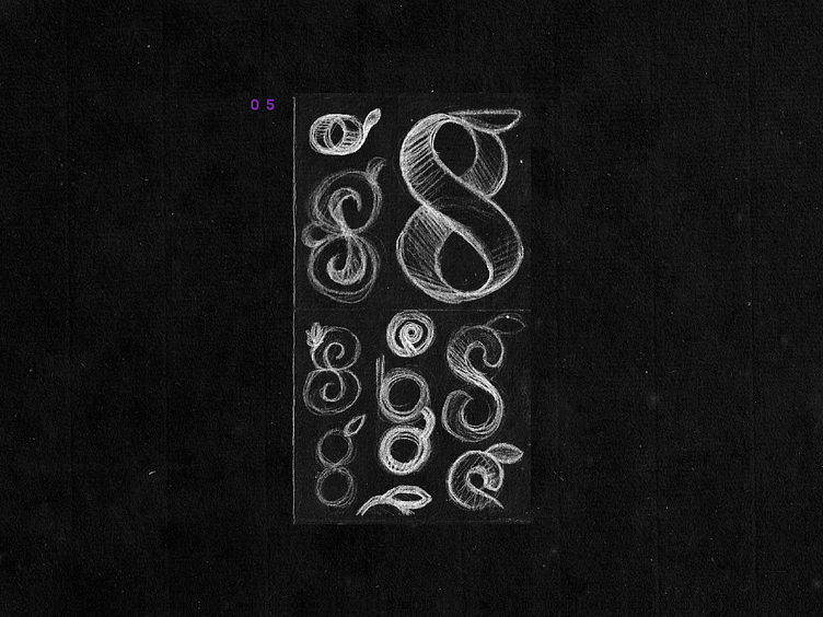
✦ This one relied on a more abstract approach to represent the "grapes" with a acronym made of a GS letters courves. Also is intended the idea of "connection" bettween each circular shapes.

✦ In a more figurative perspective, this one is a poetic idea of showing a connected circular grape-shaped mesh at your hands, suggesting the idea that you are able to be part of this transformation for good.
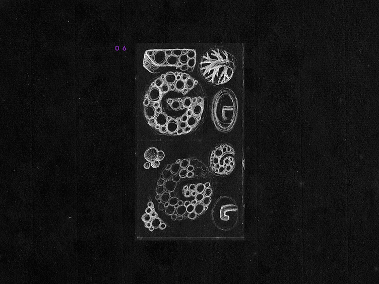
✦ Basically the G as support for a organic expansion representation, like a sprouting or something that grows from the center of the letter. Some options tries to be similar to grapes or berries, others just little branches or something.
✦ I always think may be a good idea to merge both letters in an abstract shape, so I tried here with the G+S plus kind of two berries, not the best solution visually yet but I think it can be something unique if client like the direction.
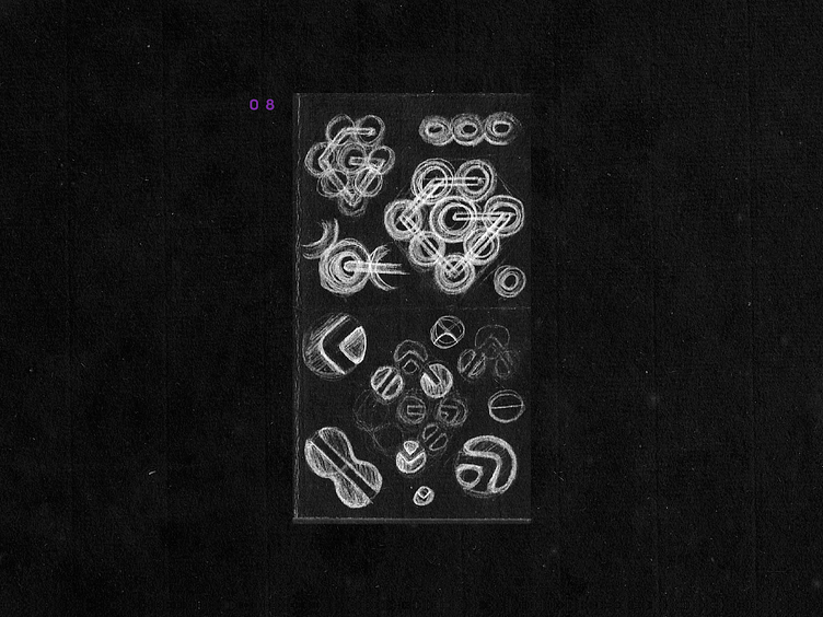
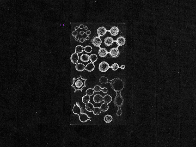
✦ I like the idea of "grape clusters" that seems as some populational counting or infographics showing some kind of distribution. This is a very abstract approach but somewhat I think represents greatly the main idea of Geffen.
✦ I think this is the most daring idea of all, I tried to portrait a human figure holding a couple of human-sized grapes (somehow seems also like hair, or that it is at his head...). I know this one have less chances, but I liked a lot this two ways possible to be seen and the unnassuming idea here.
✦ The main goal here was to represent the connection between each individual as a negative space, also in a G shape and if you want more meaning it is kind of a diamong too; showing the importance and value of the G connections.
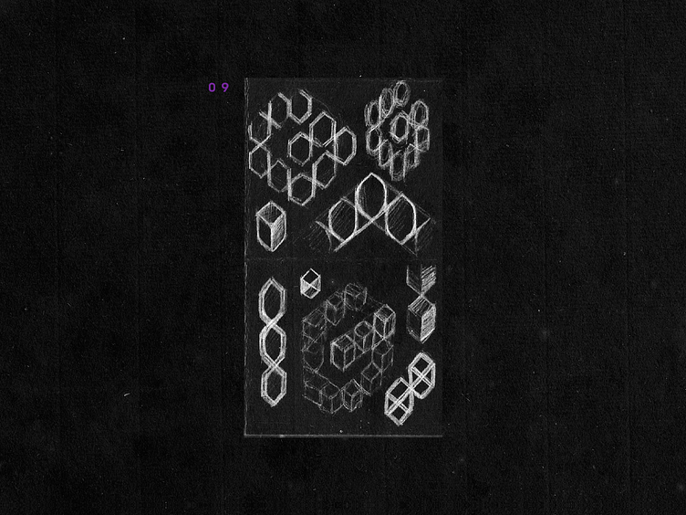
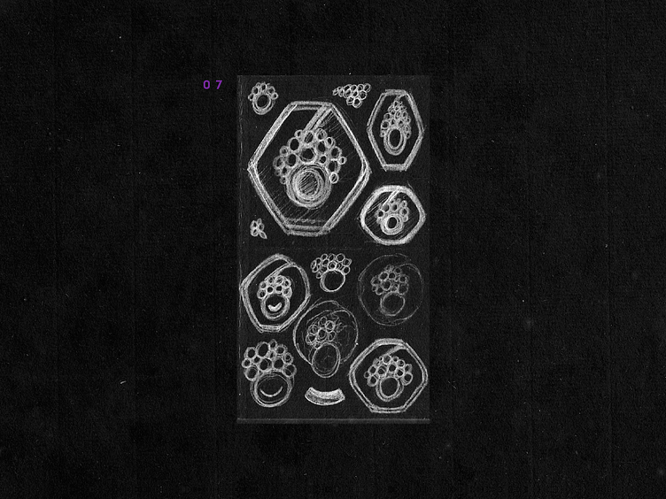
✦ Isometric plan of hexagons here, maybe too abstract to connect with the idea of grapevine, but this abstraction may be a way to go. Specially if the use of colors are grape-related, or the other Identity Elements supports this idea. Still a very abstract way of represent the idea.
✦ This chain as sketch may suggest something unintended, I know. But the overall idea was to represent the G as a chain of elements connected in a spiral path, organized in a hexagonal grid I think it may be a nice option to go with!
I hope you liked those sketching ideas!
Also I'm available for new projects, so feel free for ask me!
Need a logo, illustration or other crazy stuff? Email me now :)
Follow & Connect!


