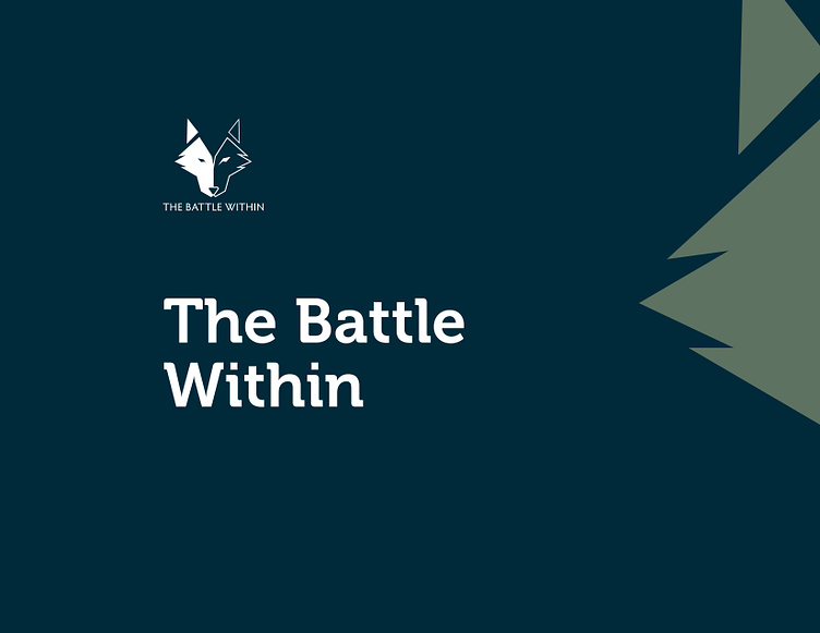
The Battle Within: Brand Guidelines
At Guild Content, we are inspired by a good story. And The Battle Within is telling a good story every day. This is an amazing organization: dedicated to helping veterans of the United States Military and first responders to have quality of life after they have served. Life after service can be complicated, and conditions like Post Traumatic Stress Disorder can hamper a life for these warriors, even subtly. The Battle Within provides space, connection, and community for these warriors to heal.
They came to us to help clarify their message, to help tell their story, and to refresh their brand.
The logo was the only element of the brand that was already established and would serve as a strong foundation for which the rest of the brand identity would rest upon. In its stark contrast, the logo symbolizes the fight going on between two wolves inside of each of us.
This color palette was directly informed by the voice and emotions of the brand. Navy blue represents trust and stability. Slate blue is calming and inspires ideas of loyalty. Green is often used to evoke wisdom, empathy, and compassion for humankind.
We believe the art of typography plays a major role in a company’s identity. Through letter forms, a company’s personality and values are conveyed. We wanted the headline font to be strong and declarative while also carrying its own personality and uniqueness. The simple and clean body copy provides a sense of trust and confidence.
When all of these elements are pieced together with purpose, what results is an outward reflection of the heart and compassion that already lives within the organization and we are honored to have had the opportunity to partner with The Battle Within.


