Find designers
Designer search
Quickly find your next designer
Post a job
The #1 job board for design talent
Inspiration
Courses
UX Diploma
Learn UX design from scratch in 6 months
UI Certificate
12-week UI skill building for designers
Live interactive workshops
with design professionals
Jobs
Go Pro
Log in
Dribbble: the community for graphic design
Log in
Sign up
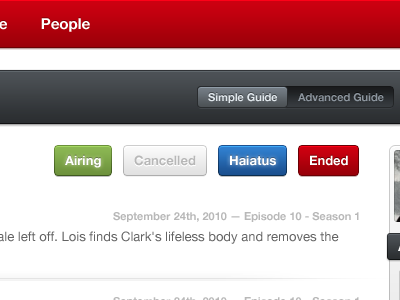
fav.tv: Simple Guide
James
Available for work
Follow
Following
Like
Get in touch
#FCFCFC
#3D3E42
#AC000B
#CA0212
#C3B7B7
#356CA7
#7BA35E
Download color palette
app
design
fav.tv
green
interface
red
startup
tv
ui
user interface
ux
web app
View all tags
Posted on Jul 2, 2011
5,379
11
107
10
View feedback
James
Designer at Wireframe Design Studio
Get in touch
More by James
View profile
Previous
Next
Loading…
Loading…
Loading…