Jones Family Farm - Rebrand

My new favorite cheesemakers wanted to step up their brand with a whole new everything. From the logo through to packaging, I had a blast working on it all.
Let's go.
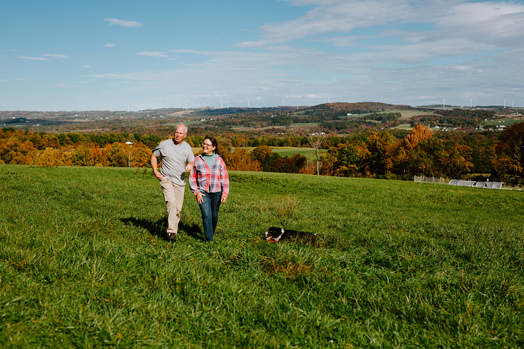
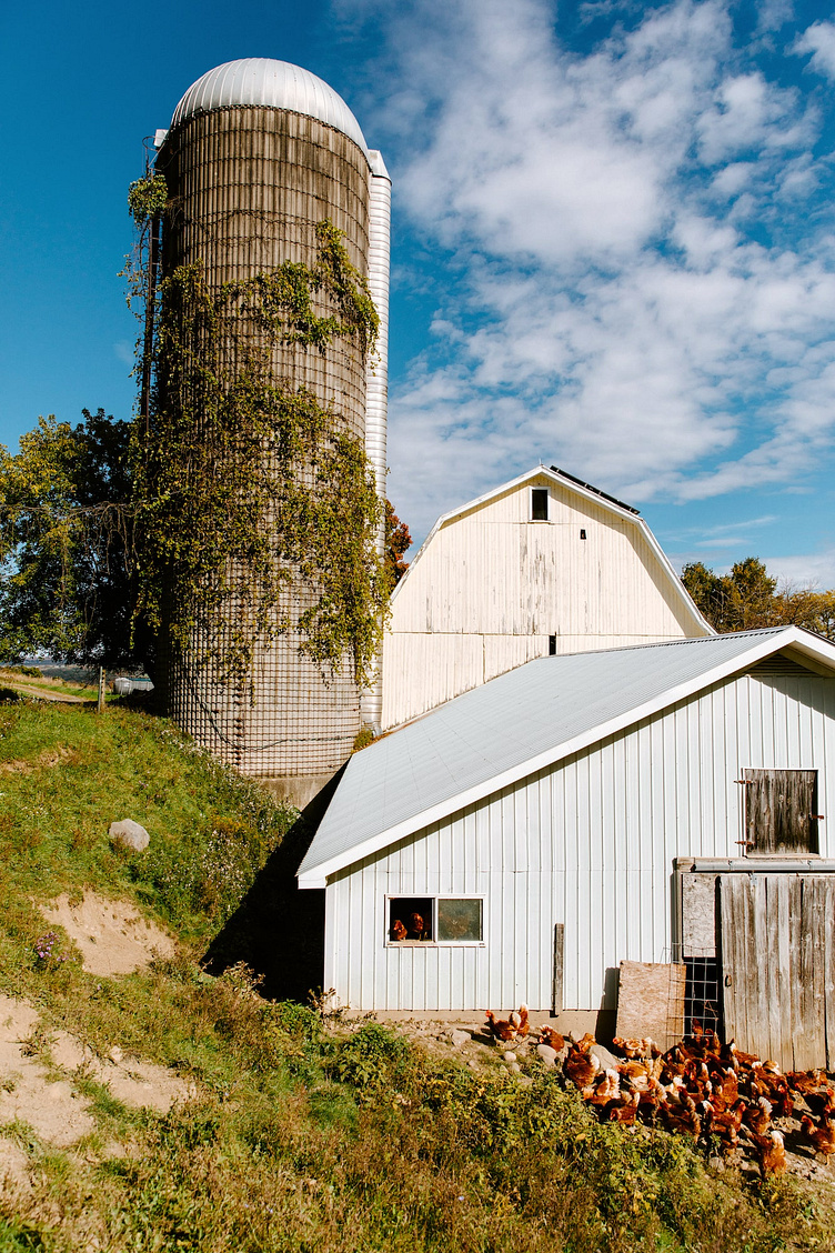
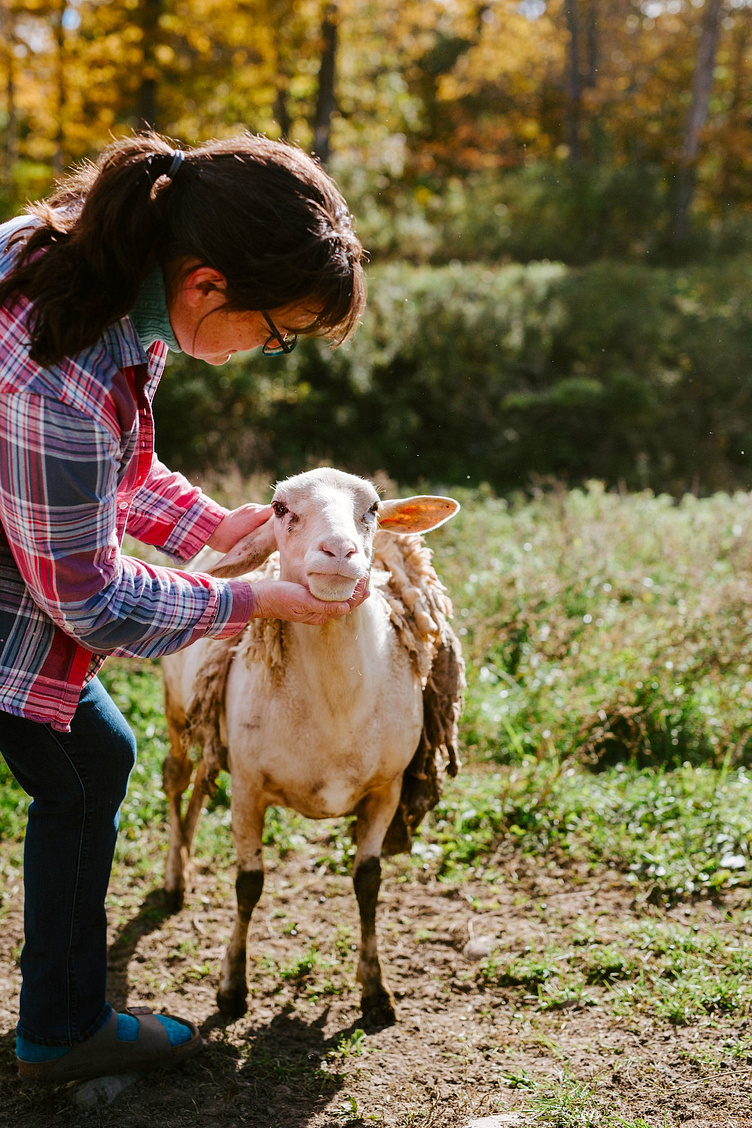
We began the project with a visit to the farm, in Herkimer, New York. We couldn’t have had a better October day to snap these photos.
(above: the original packaging/logo)
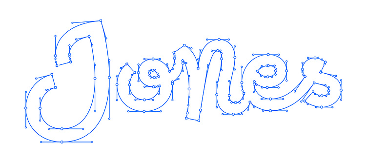
There were some things I really liked about the original logo. I wanted to keep the curve/implied oval but free up the text. The prominence of “Jones” was also something I intended to preserve. I wanted “fun” but not “childish”. Funky but legit. I love the sense of humor that Suzie and Peter have (their url is anotherjonesfamilyfarm.com - I also designed and coded the website, which is on wordpress).
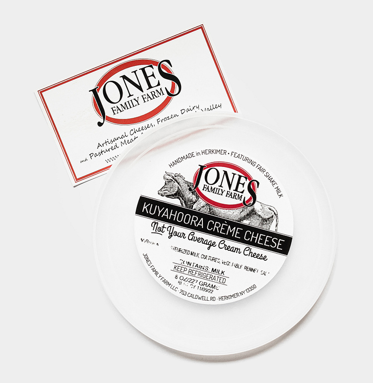
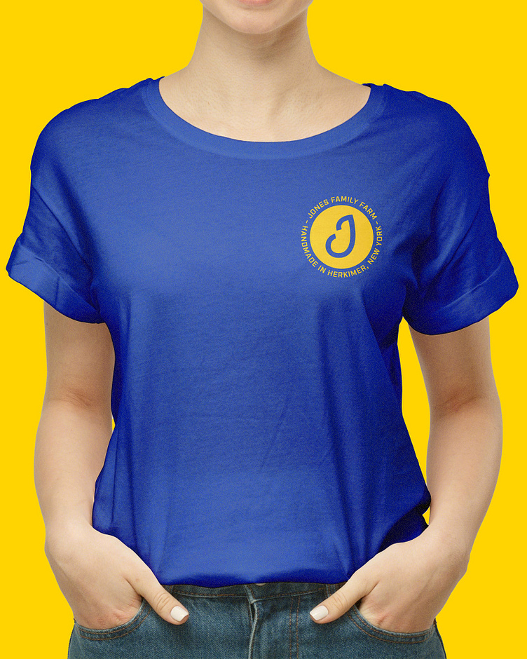
The new Jones Family Farm logo is anchored by smooth, bold, somewhat “loose” cursive script with the focus on Jones, and the “family farm” holding it together in a little smile.
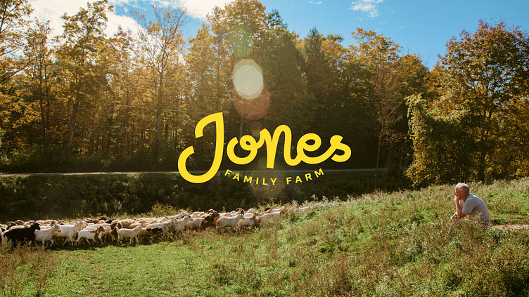
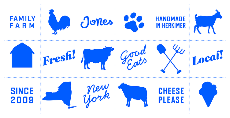
While the custom script we created for the logo was the perfect anchor for the new brand, I didn’t want to utilize a similar style for any other element. To fit as the subheading “Family Farm” I ended up creating a variable font from scratch called Dairyfarm. It features an adjustable width axis, which was worth every second spent making it.
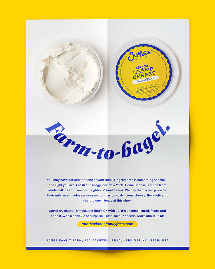
Once I had the basics down, I moved on to expand the system. The first priority? Kuyahoora Cheese. Say what now? Exactly. Their flagship product had a hyperlocal name (their farm overlooks the Kuyahoora valley) that was hard to pronounce and spell, and which didn’t help qualify the cheese itself. We created and culled a list of potential names and landed on the simple “New York Crème Cheese”.
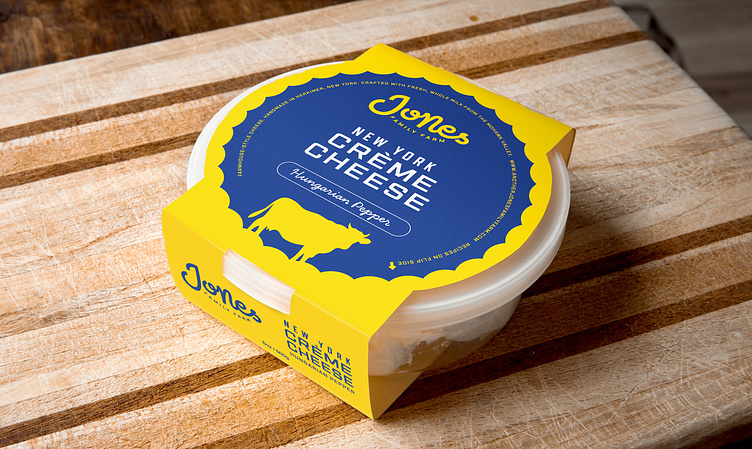
Once I had the basics down, we chose an accent color for each flavor varietal to pair with the common blue and white. The font Handsome Pro was added for a subtle human touch.
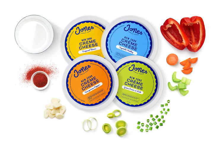
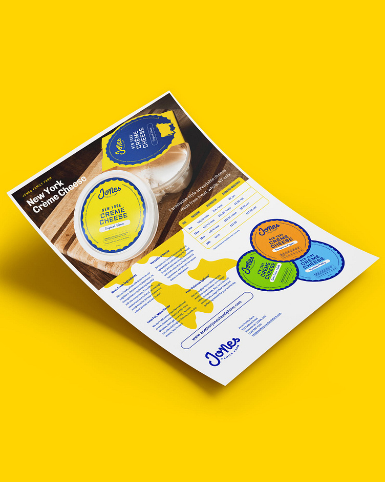
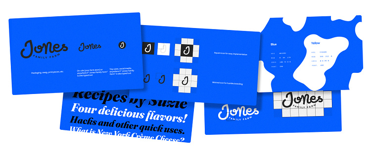
I then used the Crème Cheese packaging as our touchstone as we wrote and designed promotional materials, conceptualized other packaging, and designed and built a website from the ground up.
While we initially thought a new landing page would suffice for the rebrand, we took inventory of the existing website and figured that we could design and implement a new one quickly. We migrated all of the content (Suzie is an amazing writer and has over 100 thoughtful posts) from Squarespace and built a WordPress theme from scratch.
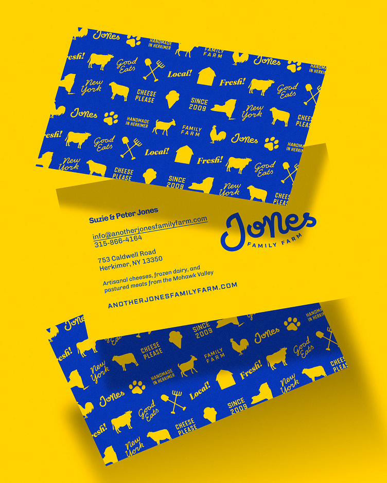
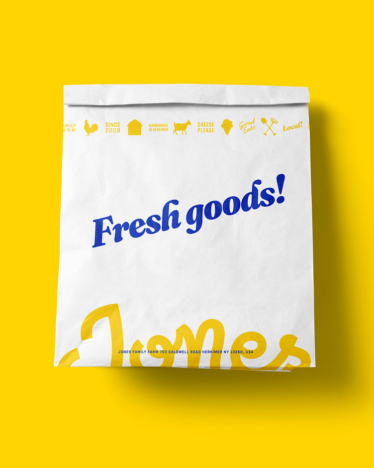
As I create the real-life, practical deliverables of a project, we stress-test our system and solidify our conventions. In this case, I wound up developing a useful pattern, an an expanded color palette, and updated logo variations in the process of putting together packaging for future products, print necessities, email newsletter design conventions. A single style from the massive typeface Fraunces was also introduced, finalizing the font options. I didn’t have to do anything for the Jones’ Instagram account because they’re rocking that like pros. Here’s a what it all looked like

We took a step back and documented everything we built and learned along the way. This took the form of a digital brand guide that covers everything from brand framework to packaging examples, storytelling strategy to logo usage. I also provided clear website documentation in the form of a video tutorial so Suzie can keep the blog rolling!
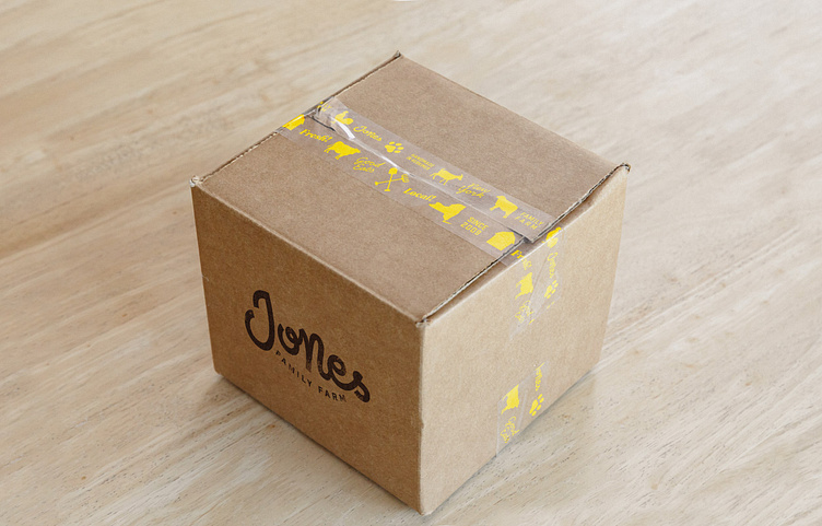
Last, but obviously not least, we launched! Following a clear launch plan, Allison and I supported the Joneses as they released their new look & feel into the world. We deployed the website, created an asset library in Canva (their design platform of choice), helped them write a few launch announcements, and finalized all of the new packaging orders.
That's it! This case study is also available here: https://projects.relays.team/jones-family-farm/


