Logo Design for a Restaurant

I really enjoyed working on this Logo :)
The requirements were pretty straight forward. The client wanted to introduce Ramen to Indian audience. At the same time, keep the logo simple to understand. As such, food has no age bar, but the target audience defined by the client for this brand is people from age 18-35. They wanted single color, solid and 2D flat logo.
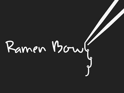
So, I picked the font which would resemble the food they were going to serve. (Font-Udon)
The client also wanted the chopstick element.
I played around with the illustration of noodle and this is the final version.
Also, lot of experimentation was done in terms of color. Using reds, blacks and whites.


