DoorCoin | logo design & Visual identity


The DoorCoin logo Design
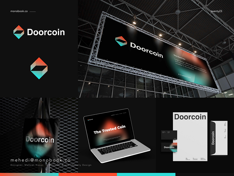
It's began with a brainstorming session to generate ideas that would effectively communicate the company's brand identity and values. Our team considered the company's mission, target audience, and industry in order to come up with relevant and impactful design concepts.
One key problem the company faced was how to stand out in a crowded market, and the logo design needed to reflect a sense of innovation and trustworthiness. To solve this problem, we landed on a sleek, modern design that incorporated a stylized "D" and "C" to form a unique and memorable symbol. The use of blue and green colors conveyed a sense of reliability and stability, further reinforcing the company's commitment to excellence.
Overall, the DoorCoin logo design effectively communicates the company's brand values and positions it as a leader in its industry.
----------
Take your brand to the next level
Feel free to reach out via Dribbble DM or E-mail:
💼 Connect with me on LinkedIn
🔗 Follow me on Instagram
💬 Tweet with me


