Britannia School *

Britannia School is a language learning center based in Kyrgyzstan, focusing in teaching British English. However, students also have the opportunity to study a range of other languages, including Kyrgyz, German, French, Chinese, Korean, and Russian.Founded in 2007, Britannia School has since become one of the most popular and successful language schools in Bishkek.
The client wanted a fresh, modern, and joyful brand identity with a focus on the United Kingdom.As the main focus of the school is teaching British English, we wanted to capture the spirit of this country in our design. To achieve this, we developed an abstract but charismatic logotype as well as a bright, smart, and responsible brand identity. The result is a cohesive visual identity that perfectly reflects the client's vision for their language school.
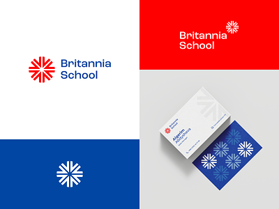
The new symbol for Britannia School represents the endless possibilities and opportunities that come with learning a new language. Its asterisk shape is a reference to the thorough and detailed explanations provided by the dedicated teachers at the school.
CREDITS:
Art Director – Eldar Esen
Design – Azat Altynbekov
I hope you enjoyed this shot! If so, feel free to follow us on Instagram and send a DM if you want to work together!
Also, the full case study is up on Behance.
Consider checking it out if you liked this project!
Thank you! Stay tuned for more projects! 🚀


