Magnetic Forest - Branding

Process
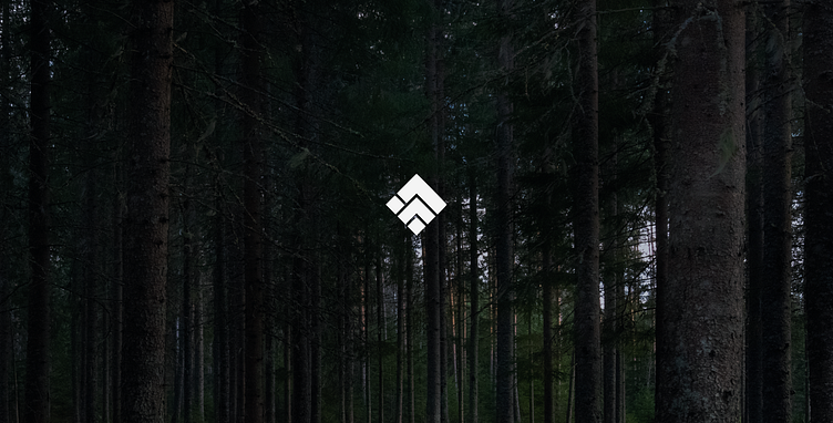
The inspiration for this project was the location of the company itself. Magnetic Forest is located in a remote area in the Carpathian Mountains in Romania. Because all of the area is surrounded with beautiful mountains and green forests, I knew that the logo and the color palette should reflect this beautiful place.
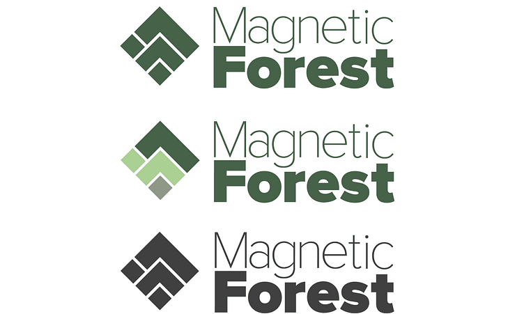
Logo
In the logo I wanted to capture the letters M and F, but at the same time the connection with nature. Having this in mind, I came up with this diamond shaped icon.

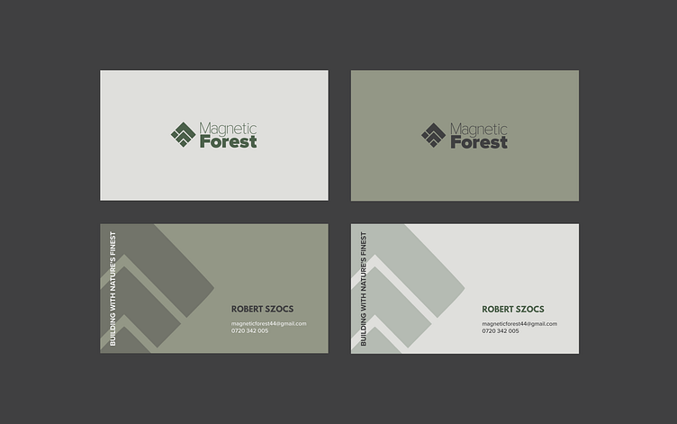
The connection with nature is best shown in the multiple coloured logo: the dar green represents the mountains, the light green in the middle represents the forests that cover the mountains and the small square at the bottom the tree trunks, in this way encapsulating the beautiful landscapes surrounding the company.
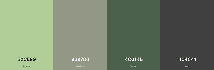
Color Palette
Using a mainly green color palette for Magnetic Forest communicates the connection to nature, environmental responsibility, and natural, organic materials. The color green is often associated with growth, renewal, and sustainability, making it a suitable choice for this brand.
What do you think?
Hope you like it, press "L" ❤️ to support my work. Have a great day!
Do you want to work with me?
You can find me here:
Linkedin | Behance | Contra | olgaradu.com | Instagram
____________________________________________________________


