Find designers
Designer search
Quickly find your next designer
Post a job
The #1 job board for design talent
Inspiration
Courses
UX Diploma
Learn UX design from scratch in 6 months
UI Certificate
12-week UI skill building for designers
Live interactive workshops
with design professionals
Jobs
Go Pro
Log in
Dribbble: the community for graphic design
Log in
Sign up
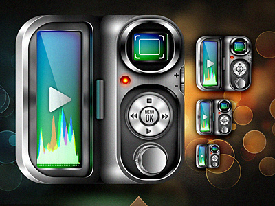
VidCam Icon
weirdsgn studio
Follow
Following
Like
#191915
#5E5F5F
#46412D
#A4A6A4
#E1E8E3
#42A3B0
#9B5A2B
#6D9767
Download color palette
icon
ios
iphone
metal
recorder
video
weird
View all tags
Posted on Jul 1, 2011
2,118
1
36
6
View feedback
weirdsgn studio
More by weirdsgn studio
View profile
Previous
Next
Loading…