Ripple Redesign concept | Power by Crypto


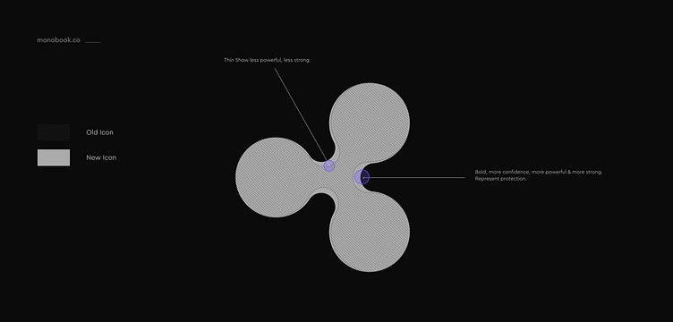
Why this mark?
Protection is the main fact here. After I research this mark I find some problem. Inside the join are thin. What show the connect with people are not strong. So I focus their carefully. Make its bold like a thin man can’t have strength on their body but A muscular people have the strength to protect. That’s why I make this.
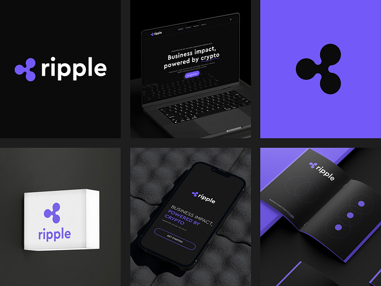
Why it’s look same?
Because the company already famous. New mark is risky for them. A designer change a logo totally but if we change the mark totally then customer can’t find or don’t understand mark. If we mark new mark then it’s need the marketing like the beginning. It’s can take company losses. I take the same DNA and change it what its need.
Full Work: Behance
Identity Designer, Motion, Art direction: Mehedi Hasan | Services: Brand Identity Design, social media graphic, UI/UX | Year: 2022 | Control Agency: ITO Studio
Let's Talk
mehedi@monobook.co