{GIF} Deconstructed Equalizer

This is one of many abstract CSS experiments I've been creating lately. If there is interest I'll post more. This one was inspired by a mashup created by @DjBahler on twitter. He rocks!
These experiments help me grow as a front-end dev by seeing what's possible via art.
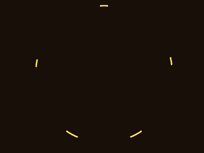
One might be surprised to hear that this effect consists of 60 circles, with large sections clipped out via the CSS3 clip-path property, and then animated using CSS keyframe animations to rotate on the Z, X, and Y axis. Further, the color shift is created by using HSL, and iteratively adding the circle's number to the hue.
Also, I added hover states to make understanding what's happening easier. Check out the link at the bottom to try it out, but not on mobile :)
As this is my first shot, it's an opportune moment to give a big shout out to: @SaraSoueidan, @crnacura, @o_telho, @DrWoohoo, and @ChrisCoyier. All of whom showed me the beauty that is possible via frontend code.
This is totally open source, so please feel free to fork this and have fun


