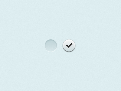
Yo, check it. (iOS UI)

Check

1 Attachment

30 Responses (page 1 of 2)

  1. Jamie McElwain Jamie McElwain

    Awesome! Any clues as to what this is for? ;)

    likes

    almost 2 years ago

  2. Miro Keller Miro Keller

    I'm missing a hint of X on the empty circle... I'd say the "off" state is not at all obvious what it is for. Looks awesome nevertheless :)

    likes

    almost 2 years ago

  3. Stéphane Reverdy Stéphane Reverdy

    SO this is basically the new design for viagra, no ? BONER Alert.

    likes

    almost 2 years ago

  4. Will Voelker Will Voelker

    simple and effective. sweet shot.

    likes

    almost 2 years ago

  5. mediahack mediahack

    firstly they look great. both very crisp and very clean. it may be an illusion but the left looks higher than the right.

    likes

    almost 2 years ago

  6. Pro Morgan Allan Knutson Morgan Allan Knutson

    No clues on this one Jamie :)

    Miro, it's totally stripped of it's context. It makes sense in app.

    likes

    almost 2 years ago

  7. Pro Morgan Allan Knutson Morgan Allan Knutson

    Good call mediahack, though the placement is only for dribbble, and in app they're vertical. Imagine editing your email in mail. This replaces the check mark.

    almost 2 years ago

  8. Pro Alex Pankratov Alex Pankratov

    Nice polish.

    likes

    almost 2 years ago

  9. Pro Tony Andújar Tony Andújar

    nice and simple

    likes

    almost 2 years ago

  10. Sawyer Hollenshead Sawyer Hollenshead

    I'd push the hell out of that button

    likes

    almost 2 years ago

  11. Tim Jones Tim Jones

    Slick

    likes

    almost 2 years ago

  12. Tanner Christensen Tanner Christensen

    So so clean. Consider this design *puts sunglasses on* "checked."

    likes

    almost 2 years ago

  13. Pro Dan Berko Dan Berko

    YYyyyyyeaaaaaaaaaaahhhhhhhhhhhhhhhhhh!!!!!!!!

    likes

    almost 2 years ago

  14. Pro Mauricio Estrella Mauricio Estrella

    Great detail, but lacks some discoverability / usability imo.

    almost 2 years ago

  15. Pro Morgan Allan Knutson Morgan Allan Knutson

    Mauricio, it's a circle with a check mark and absolutely no context.

    I appreciate that you took to the time to critique, but your statement is irrelevant.

    likes

    almost 2 years ago

  16. Mike Puglielli Mike Puglielli

    This is what is fascinating about dribbble.

    That a incredibly simple icon (of high quality mind you) is most popular. Not that this is a bad thing, but the human element certainly is fascinating.

    P.S. Looks wonderful :)

    likes

    almost 2 years ago

  17. Pro Morgan Allan Knutson Morgan Allan Knutson

    Interesting observation, Mike. Surely, this check mark is only a check mark.

    Here's the original that I replaced, designed by one of our peers at Apple - http://cl.ly/83AP

    Please tell me if I posted that icon that it would also be popular right now.

    almost 2 years ago

  18. Mike Puglielli Mike Puglielli

    I am not sure if you're being sarcastic or not, I wasn't trying to offend you. I did not mean to devalue your work...So I don't know how to respond to your question...

    That red check mark does too look good... :)

    almost 2 years ago

  19. Pro Michael Sigler Michael Sigler

    I'm with you Mike. Morgan has certainly made an attractive checkbox but what's really fascinating here is, as you said, the human element.

    I'm not disparaging your work Morgan. What's interesting is that in the context of the rest of your work and the work of other fine people on Dribbble, the popularity of this piece is a bit comical.

    Sure its a very nice checkmark but at some point you have to admit it's just a button, similar to many thousands of other buttons. Some better. Some worse.

    likes

    almost 2 years ago

  20. Buck Buck

    Well said, Sig. Popularity is a cruel mistress.

    almost 2 years ago

  21. Pro Morgan Allan Knutson Morgan Allan Knutson

    I get the comical nature of the fact that it's a such a small element.

    But honestly, it's not just some throw away bullshit. This little check mark and button are the culmination of years of experimentation and experience.

    I also understand the fact that it seems unfair in a sense, as if people are only liking this little button because they're following me. That's simply incorrect.

    Look at the shot before this one. I feel it's some of my best work, yet it's likes pale in comparison.

    Do you really feel that people are liking this purely because I made it?

    You're seriously over-estimating my popularity.

    almost 2 years ago

  22. Pro Morgan Allan Knutson Morgan Allan Knutson

    Also, you should keep in mind that Dribbble has somewhat of a bias towards UI stuff. It's a general trend that I've noticed.

    All said, what's your point?

    almost 2 years ago

  23. Pro Michael Sigler Michael Sigler

    My point is not a criticism of this icon. I don't believe I implied that this piece is "throw away bullshit". It's a pity that you seem to have taken it that way (and maybe you didn't, the internet can be terrible at conveying intent).

    Perhaps in my previous statement I should have kept the context within the bounds of only your work. As far as Dribbble users go I think its fair to say that you are a popular user. That popularity is not something I'm commenting on. I for one despise any sort of knee-jerk criticism based on the popularity of an artist or style. It's not a band wagon I like to ride around on.

    My point is, as you mentioned, that your previous post, which is not only thoughtful but unique, has fewer likes than this piece. Obviously "likes" aren't the best measurement tool but it does illustrate our human nature to gravitate towards things which are instantly gratifying.

    It's easy to see that this is a great icon. I simply believe that you have many better pieces and that it's unfortunate that some of them haven't risen in popularity as quickly as this one. This isn't a trend restricted to yourself and its a trend I find fascinating.

    That is what I believe to be a reasonable and thoughtful "point."

    almost 2 years ago

  24. Mike Puglielli Mike Puglielli

    I think Sig has some good points, but I wasn't making a comment on his popularity. I was in fact making an observation that its so strange that something so simple in size and context as a check-marked button, something we've seen a thousand times, would be front page, most popular post where as something like this SNES Controller is seemingly more complex and intricate, doesn't make headlines.

    It is a great check-mark button. No question everything we do is derived from previous sweat, blood, tears, well you get the point.

    Whether its Morgan's popularity or not, I am not to comment because I follow him because he makes great work.

    I guess a better question is what criteria do dribbble users use to determine what is most popular or not?

    almost 2 years ago

  25. Pro Alex Pankratov Alex Pankratov

    Fellas, stop looking at absolute numbers and look at percentages.

    338 likes per 3690 views is a bit under 10%. This is your typical "well-done, pat-on-the-back" shot. "Excellent" will be in 10-15% range, "Superb" will be in 20s. Just scan through popular entries and you will see that this metric pretty accurately describes the awesomeness of the shot.

    The fact that this shot made to the top of the Popular with less than 10% likes while better liked shots did not - that's an issue with a shot ranking algorithm. An entirely different matter. Perhaps it gives too much weight to the absolute Like numbers, perhaps it looks at the number of poster's followers, or an age of an account... only Dan & Co. know.

    likes

    almost 2 years ago

keyboard shortcuts: previous shot next shot L or F like