Brand Identity | Luneta


A spyglass is the object that opens the way to a new reality. Through it it is possible to see what is far away, such as the future, for example.
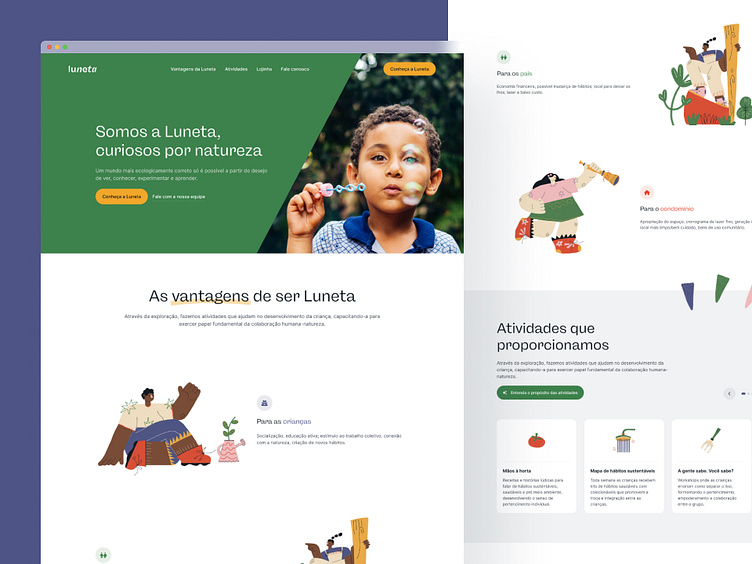
Luneta, portuguese word for spyglass, is a service that brings the sustainable future closer to children aged 7 to 12 years old who live in condominiums in São Paulo (Brazil), in a playful, recurring, simple, positive, humane and certainly very curious way.

Through exploration in activities that support child development and impart knowledge through non-formal education, we will lead children to practice planting, harvesting, recycling, reusing, and other practices that adjust our route to a more sustainable future as they plant the seed of these habits in their homes.
The Luneta brand was made to convey simplicity, positivity and curiosity through the details. The logo was designed to bring out that dynamic aspect of a scope's own shape that grows and expands. Also, colors are fundamental to bring these aspects in a playful way.
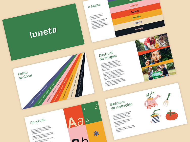
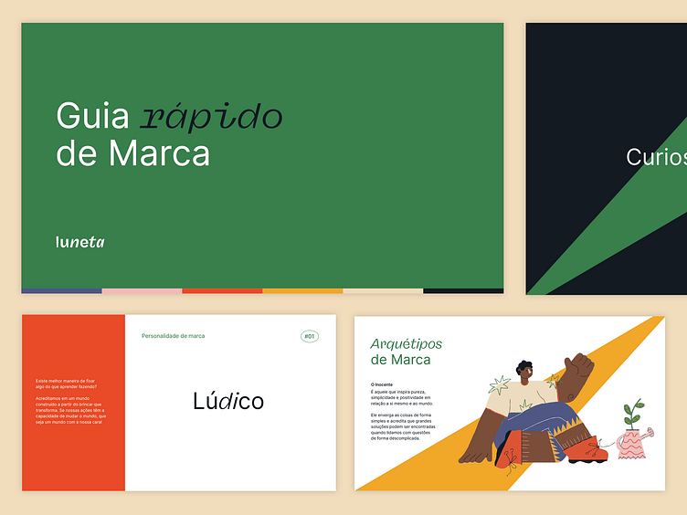
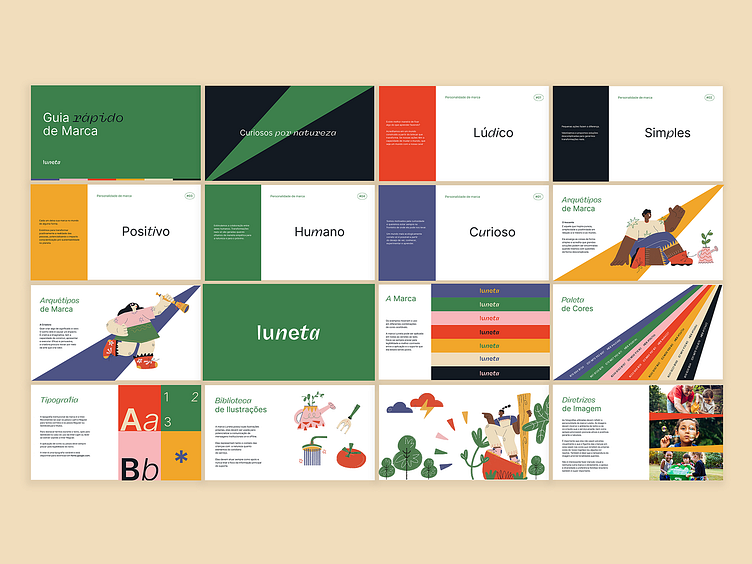
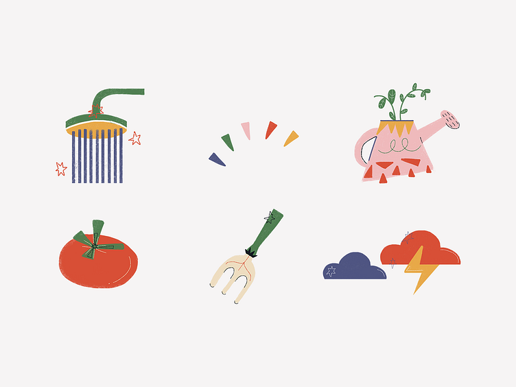
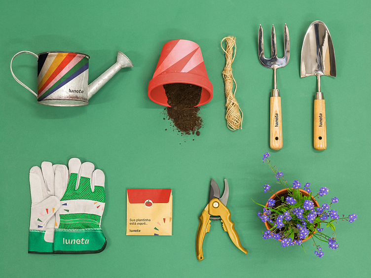
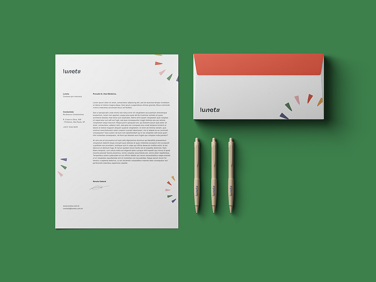
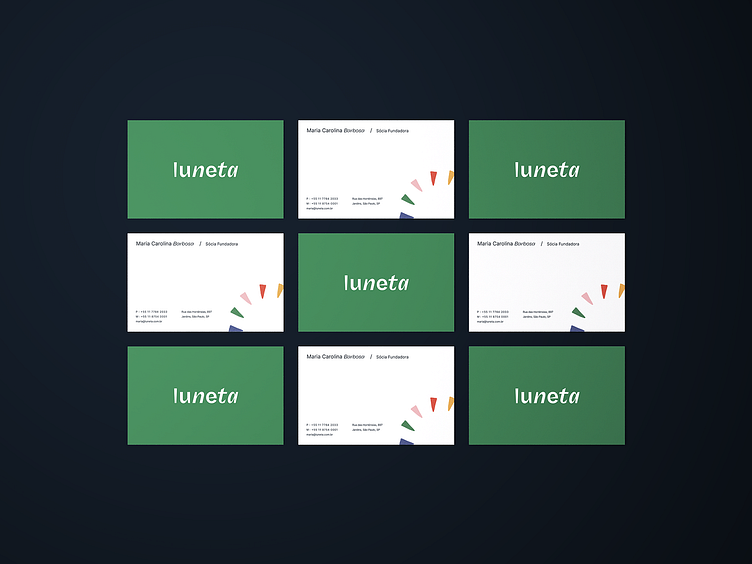
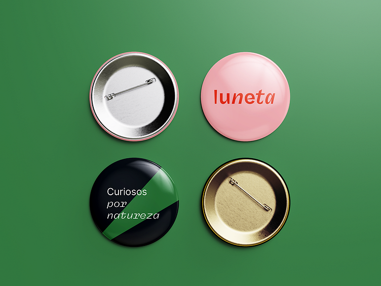
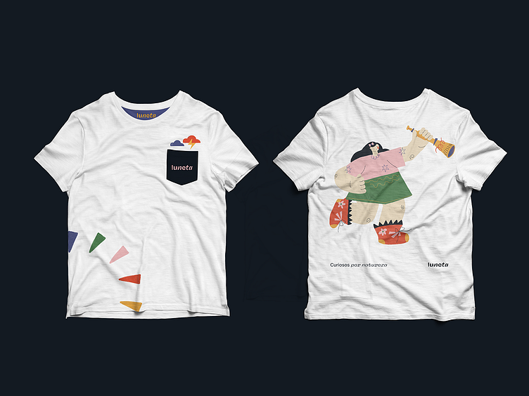
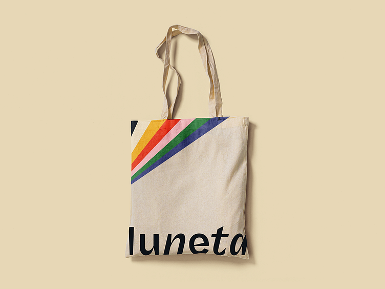
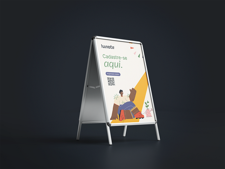
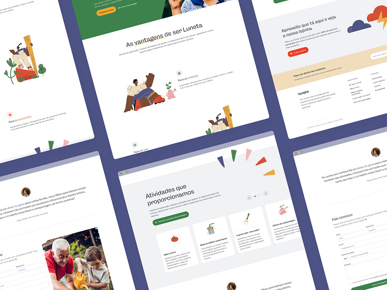
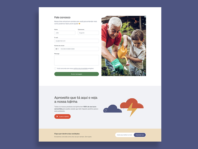
Here are more developments of the Luneta visual identity. All touchpoints were designed to add not only to the experience in the space where the service is performed but also later when the children and their parents take our gardener kit it to their homes, for example.

Logotype Design by Maria Carolina Barbosa and Luis Fernando Lima
Brand style guide, Illustrations and Graphic Design by Maria Carolina Barbosa
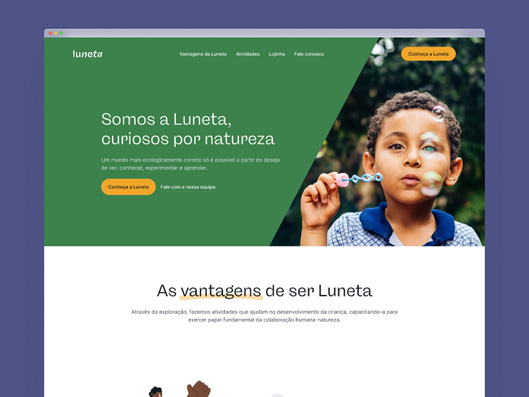
UI Design by Luis Fernando Lima
-
Let's work together? Say hello at oi@mareacarol.com, and don't forget to like 🌟


