Jonwileyaustraliacrop

Google Search navigation

Screen_shot_2011-06-28_at_6

33 Responses (page 1 of 2)

  1. Jonwileyaustraliacrop Jon Wiley

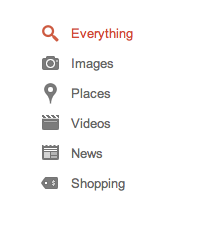
    We're working to get more focused about how we use color across Google Search. Previously, these icons were a rainbow of flavors.

    11 months ago

  2. Pro Screen shot 2011-11-13 at 12 Jordan Little

    Yes. Yes. A thousand times yes.

    likes

    11 months ago

  3. Pro Fake Ricardo Rauch

    I love all the new work from your team.

    likes

    11 months ago

  4. Pro Recent 11 Mauricio Estrella

    Welcome to Dribbble. Great looking icons. I never liked the rainbow option. :D

    11 months ago

  5. Pro Avatar Riste Lazoroski

    Nice and Clean! I love it

    11 months ago

  6. Pro Ni_may11_01 Nicola Armellini

    Looking really nice!!
    Love this new direction in your designs!
    Keep it up!

    11 months ago

  7. Pro Photo Mark Heggan

    This is much better, looks very clean. Welcome to dribbble!

    11 months ago

  8. Pro 3f6bfe56a32e11e1a9f71231382044a1_7 zee7 ✽

    lovely icons!

    11 months ago

  9. Pro Kamil Kamil Khadeyev

    Nice glyphs. welcome!

    11 months ago

  10. Pro Thotto Thomas Otto

    The updated design looks much better. The new focus is great and guides the eyes more then before :).

    11 months ago

  11. Pro Karol2 Karol Krakowiak

    Wow, really nice. Now it's much better. :)

    11 months ago

  12. Pro 123 Dan Berko

    Looking really great!

    My only criticism is concerning the News Glyph. I'm not sure if I identify it as either a webpage or a newspaper. Not that it completely matters, as you can get news from both. I suppose it just kinda bothers me because I'm not sure which it is!

    Welcome to Dribbble!

    11 months ago

  13. Pro Glasses2 Andrew Fiorillo

    Yes! I'm all for monochrome icons there. I find the current colorful ones distracting. I think the color makes it feel more like a "website" when I think it should feel like just a clean and efficient tool or utility.

    11 months ago

  14. Pro _headshotcopy Alex McNeal

    I noticed this a few days ago on Google and just saw your post. I love it, MUCH cleaner. Not really a design aspect, but only thing bugging me is the map following when scrolling. As a user it just seems annoying rather than useful and helpful.

    Welcome!

    11 months ago

  15. 00000009 David Yen

    the new results page looks awesome jon! excited to see what else is cooking :D

    11 months ago

  16. 37177_1529215145563_1090230245_31392627_1586237_n Chris Lee

    Excellent new design.

    11 months ago

  17. Pro Square Justin Edmund

    can has now? pleez?

    11 months ago

  18. Pro Twitter03 Ricardo Salazar

    Much better

    11 months ago

  19. Pro Ted-imac-128 Ted Goas

    Nice overall. A little tough to glance at the icons for 'News' and 'Shopping' and make the connection.

    11 months ago

  20. 2 Matthew Walton

    The general look is so much better. As Alex said, much cleaner. Great work.

    likes

    11 months ago

  21. Jonwileyaustraliacrop Jon Wiley

    Thanks, everyone! I should note, lots of designers are working *right now* to bring even more design goodness to Google. Should be fun.

    Also, we're hiring. :-)

    likes

    11 months ago

  22. Pro Mbd-skull-logo-white-simplified Mark Bult

    Saw it live today. Looks great. Well done.

    11 months ago

  23. M2 Andy Cquence

    Regarding the colorful icons, I don't see a lot of reasons to have icons and not use colors with them, provided that they are not all of the same color. Color is a good way to help in finding something for the user. Also, I don't like the search results left aligned again.

    11 months ago

  24. Avatari Astrit Malsija

    I loved always google but now im crazy about it i love all services that google offer and with the design retouch is gonna be much more awsome so just keep it up.

    11 months ago

  25. Pro Avatar-zuti_normal Damjan Stankovic

    It's such a natural and subtle change from the last (Which was also great) but this one brings so much more identity. I guess its just one piece of a whole puzzle, and everything will fall into place over time, already everything looks so consistent (gmail, google search etc..) Cant wait to see new stuff you are working on. Awesome job, im in love with it ;)

    11 months ago

More by Jon Wiley

keyboard shortcuts: previous shot next shot L or F like