Holistic Healing Brand Identity

Nadine no longer felt joy or satisfaction with her well established Nail & Beauty Business. She now found it to be unfulfilling, and not reflective of who she was, or how she wanted to help her customers.
Over the past few years Nadine had evolved spiritually and emotionally, but her business had not followed suit. She had been offering her new Massage and Holistic Wellness services for the past few years to her clients, but they only wanted one thing from Nadine - Beautiful Nails!
While she occasionally got the odd customer for these newer services, it was not enough to make a sustainable business out of.
It was important to her to change her services, so she could help her customers on a more spiritual and emotional level. It was time for Nadine to make a pivot and start attracting customers that actually wanted her services.
After finally reaching out to me (Jacqueline, a brand designer at ebble valley), Nadine posited whether a new website would help her market her new services better. Whilst this was true, it was obvious to me that it was far more pertinent for Nadine to have a Brand Refresh.
Her current customers only thought of Nadine for one thing - Nails! This had to change. To paraphrase Marty Neumeier - a brand is not what the business owner says it is, it is what their customers and employees say it is. If Nadine's customers were saying one thing, and she needed to be another, something vital had to change.
Nadine's current customers were never going to give her the time of day for her new services, because they only wanted what they were already getting (Nails). Therefore, through strategy, I helped Nadine discover who would benefit the most from her Massage and Holistic services, and built Nadine a strategy to help and attract her dream customers.
Following laying out Nadine's strategy, I designed her Brand Identity to reflect the experiences that I knew Nadine's dream customers would desire and be attracted to. Which has led me to this post.
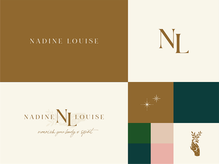
From above, you can see her logo suite is simple, mainly typography based, with her wordmark and brandmark the most prominently used. Her tagline and brand illustrations are also included in her full logomark design.
The dark blue signifies a relaxing (sleepy - night sky) experience. The green signifies her natural products (or even walking through a forest). The nude and pink signify femininity and her massages and facials. The gold signifies a luxury and indulgent experience.
Her brand illustrations were chosen to reflect Nadine's natural products she uses, illustrate Nadine's relaxing Massage and Holistic Wellness services clearly.
Nadine's brand has the basic essentials to help her business flourish the way she desires. But branding is a long and arduous process, one that can easily be derailed by the business owners good intentions.
Without consistency or clarity, any changes a designer makes can easily be forgotten and send your business back to square one. Your business is nothing without your customers, and if you confuse them, you will lose them. So don't forget to use and stick to your brand guidelines to ensure you are showing up to your customers consistently. Consistency is essential to building trust and brand loyalty, which is paramount for your business growth.
----------------------------------------------------------------------------------------------------
If you have any questions or feedback, please leave a comment, or email me (Jacqueline) at ☞ ebblevalley@gmail.com


