Improving ISO 7010 signs

I've finished a personal exercise to develop a signage system inspired by ISO 7010: https://en.wikipedia.org/wiki/ISO_7010
In this proposal, I tried to maintain the design successes of ISO 7010 and simultaneously refine or even completely redesign some of its pictograms.
Signals close up
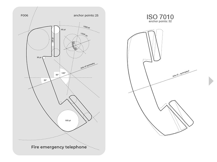
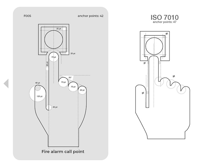
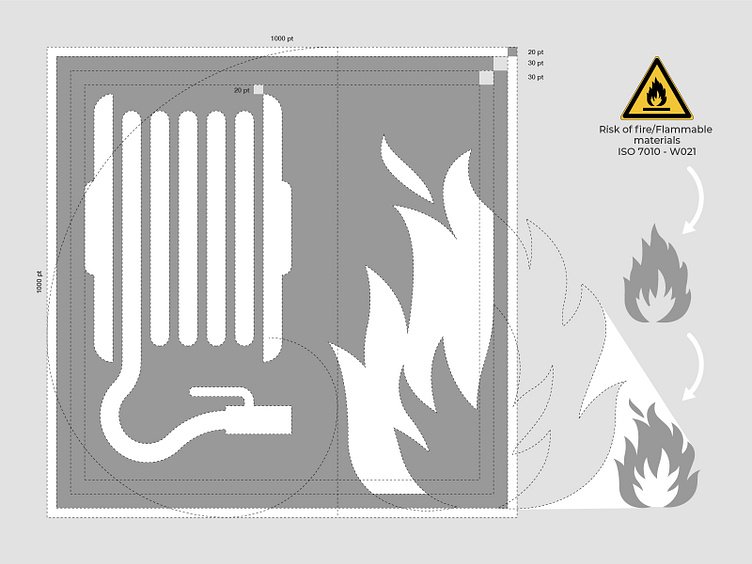
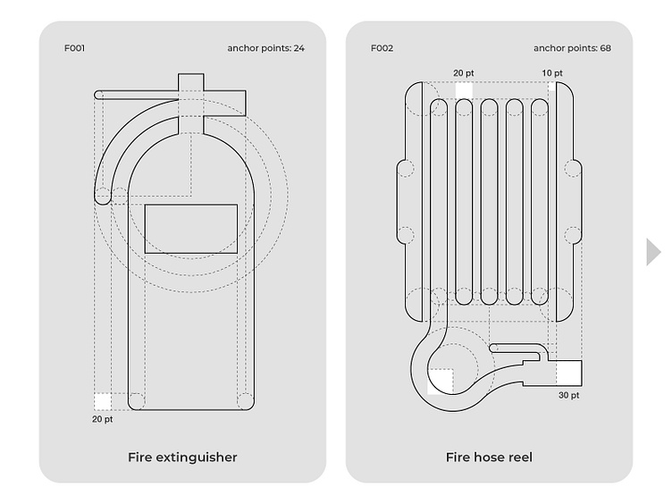
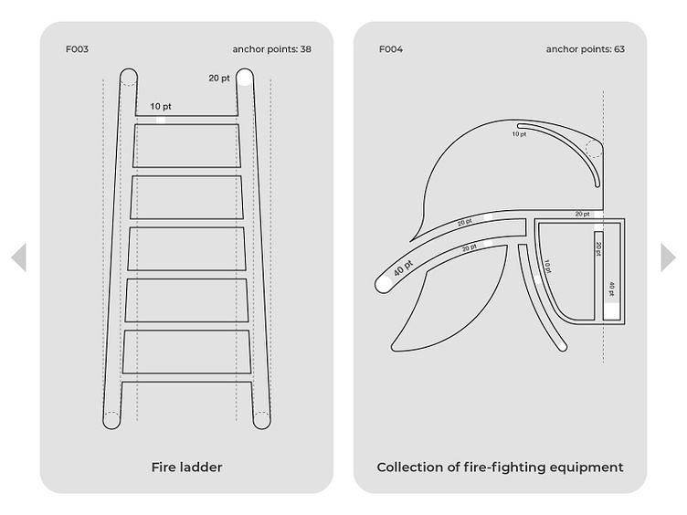
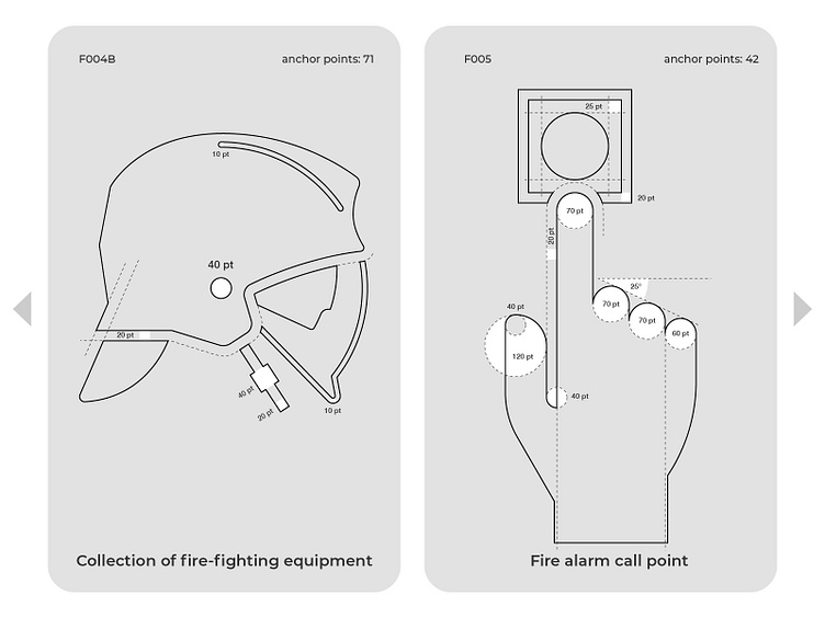
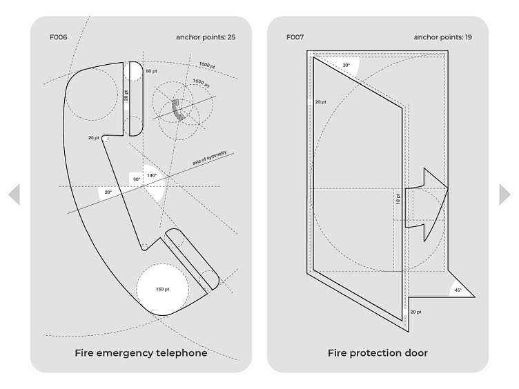
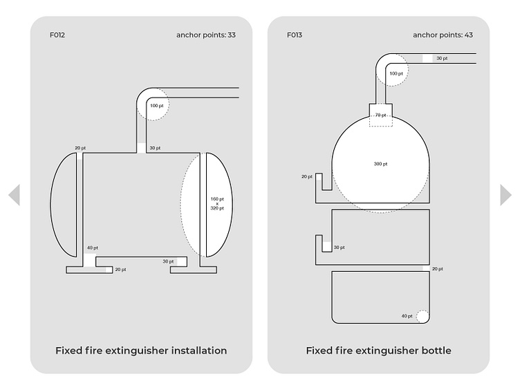
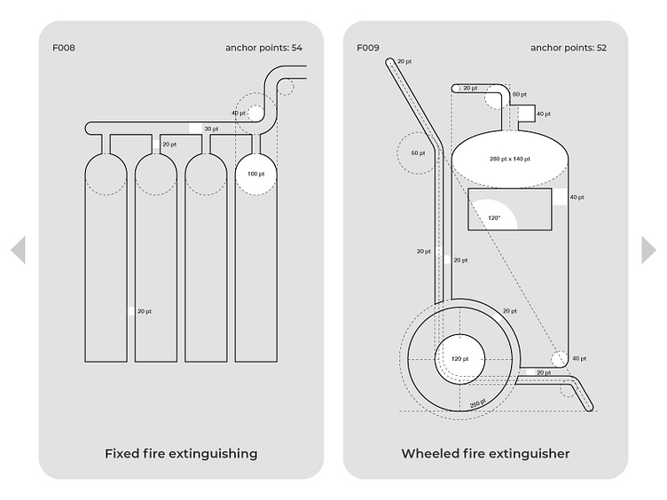
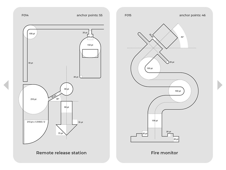
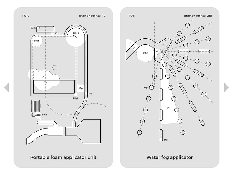
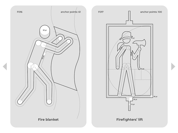
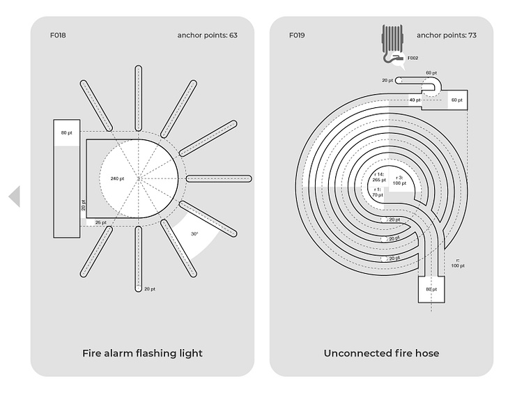
One of the main objectives of this exercise was to standardize, systematize and homologate the elements that make up each sign so that they share the same design characteristics among all of them (such as margins, line thicknesses, separation of figures, scales, angles, radii of rounded corners) and thus be perceived as part of the same visual system.
Before & After
The devil is in the details
Comparison between pictogram design.
Comparison between margins.
Signal layout
The fire pictogram is a facelift of the fire risk ISO pictogram.
Pictogram design
I published a daily comparison/vote of a different sign on my Instagram account and a vote was carried out in my stories to determine the public's assessment. If you are interested in the result of this exercise. You can even still participate in the vote in my highlights. https://www.instagram.com/gyginfographics/
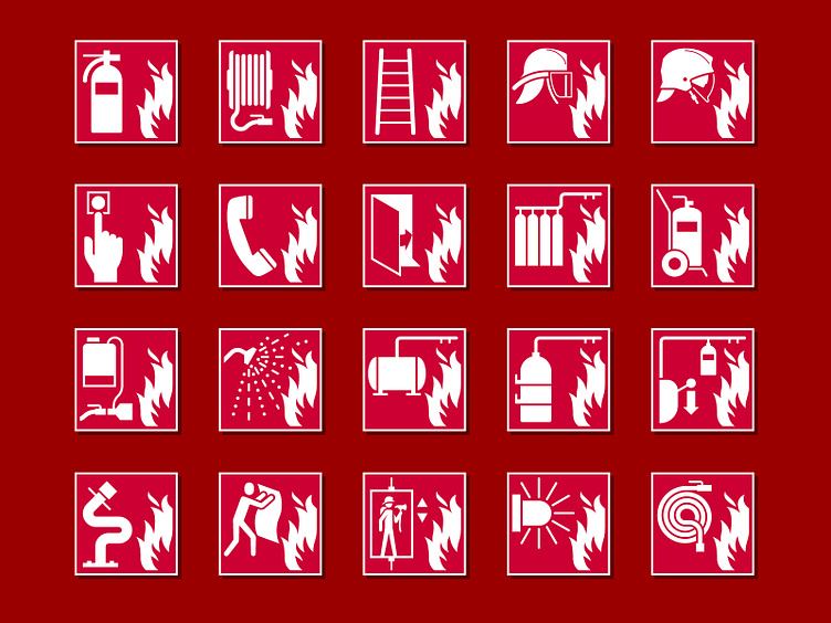
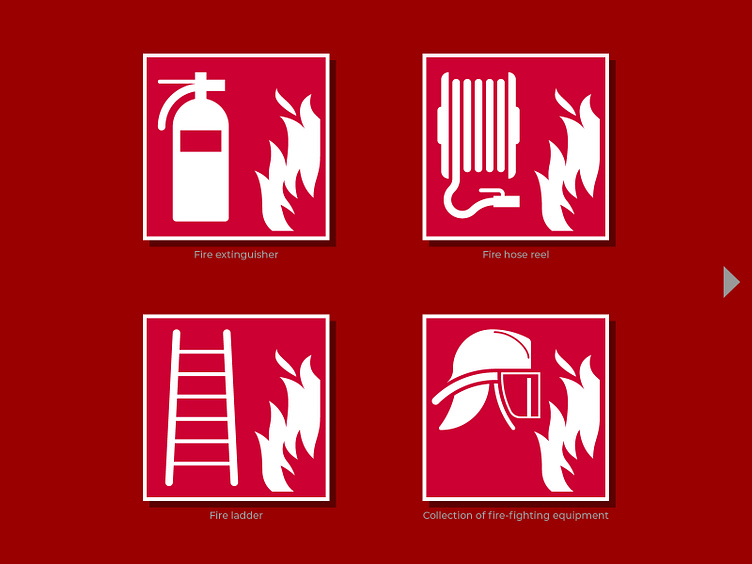
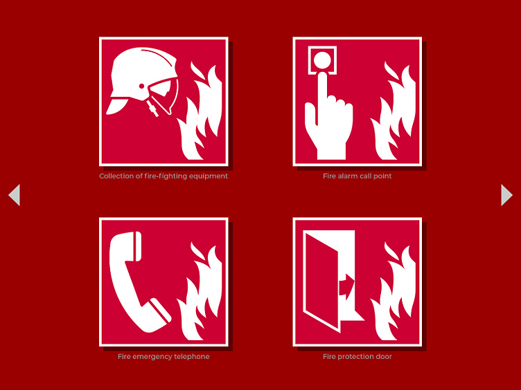
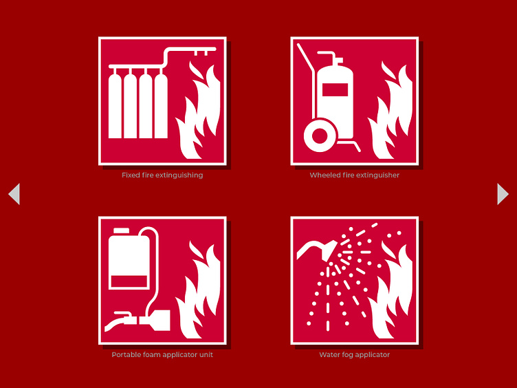
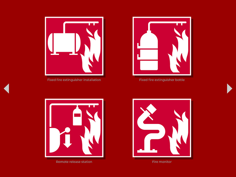
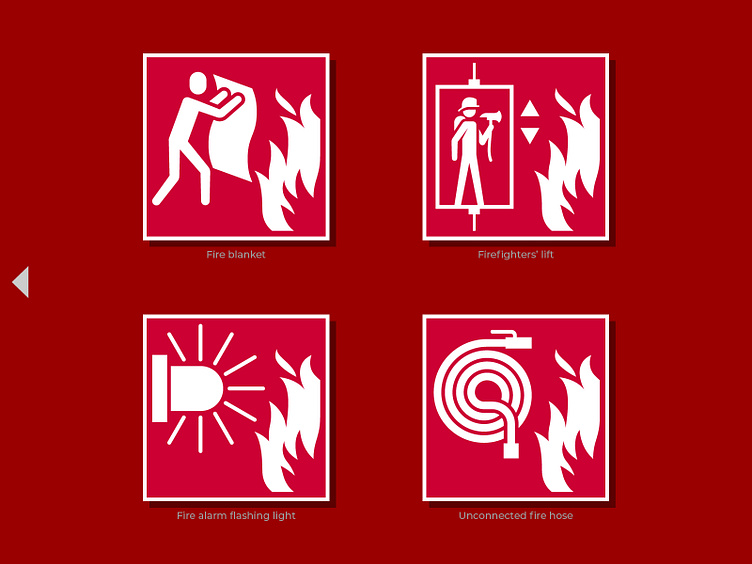
For the moment the redesigned signs were those related to fire management and control, but if all goes well I will continue until I redesign the entire collection.
Do you think this search to improve these signals make sense?
Please share if you think it is of interest to someone else.
Thank you for reading this far.


