Lab Task Equipment Ticket Tracking

Lab Task is a mobile enterprise app dedicated to improving communication, tracking, and organizing of equipment in biotech laboratories.
Timeline: May - October 2022
Responsibilities: User research, UX, UI, brand design
Tools: Figma, Overflow (user flow diagrams), POP (prototyping sketches)
The Challenge
Biotechnology companies hire entire teams dedicated to maintain and fix equipment in laboratories. Individual teams keep track of information and equipment history in their own way using Excel spreadsheets or Word documents. They also often relay equipment information to lab staff via email or word of mouth. This current system does its job but is there a way to optimize this process to boost productivity for both lab staff and lab operations teams? My goal in this project is to help biotech companies implement a lab equipment tracking system via mobile enterprise app to:
1. Easily report broken equipment on a company shared platform
2. Provide clear communication across teams on ticket progression
3. Create a space to organize equipment information
What is our solution?
Our solution is to design better communication lines between lab staff and lab operations teams to create transparency about how equipment is being fixed and centralize the location of equipment information so that all teams have ownership to the information they need.
01. How other industries approach enterprise help desk solutions
To first get a better sense of my issue around broken lab equipment, I conducted Secondary Research collecting qualitative and quantitative data to see how departments in other industries report problems. I did some quantitative research to see how and why help desks were implemented into businesses and Universities and their benefits. Studies had shown that contribution of help desks increased revenue and customer satisfaction.
02. Finding the right users in the biotech industry
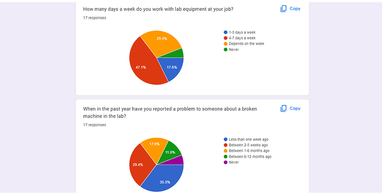
I then collected my own data in the biotech industry by using Surveys and User Interviews with five employees that work with lab equipment routinely. I also screened for users that were not satisfied with their current equipment handling system. I conducted these interviews either in person or online via Microsoft Teams. During the interviews I asked them questions to learn about their experiences with communicating, organizing, and documenting broken lab equipment.
03. Narrowing down three user types that work with lab equipment
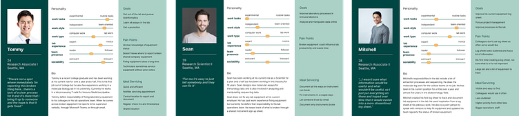
After my user interviews and throughout my project journey moving forward, I tried to keep in mind three types of users by creating the following Personas:
Mitchell: Helps to fix equipment by troubleshooting, communicating with internal and external technicians, and using an excel sheet to organize information Tommy: Is a novice working in the lab and reports broken equipment to a Lab Operations Team
Sean: Is experienced working in the lab and reports broken equipment to a Lab Operations Team
04. Understanding user pain points with inefficiency, uncertainty, and lack of ownership with their broken equipment
I further synthesized my users data by creating Empathy Maps of all my user types, Jobs-to-be-Done so that all job types are considered when designing, and an Affinity Map to group my user data into five main themes to find similar pattern across users.
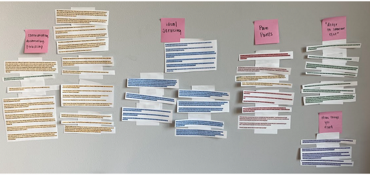
A lot of data was collected on how users communicate, document, and currently track their broken equipment but the following themes gave me the most insights into our problem:

05. Generating as many possible solutions to address user pain points
The following How Might We Questions grounded my design moving forward so that I always consider my user’s needs:
• How might we support clear communication among stakeholders?
• How might we make asset management simple at scale?
• How might we keep stakeholders aware of their ongoing maintenance needs?
• How might we encourage buy-in among stakeholders?
In this discovery phase of my design, I generated my ideas by addressing each of my How Might We Questions with as many solutions I could come up with. I got most of my inspiration of possible solutions by looking at other mobile and desktop designs of helpdesks, what works in users’ current system and from ideal servicing ideas from my user interviews. I also created sketches to visually get some of my ideas on paper.
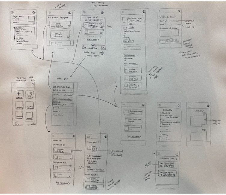
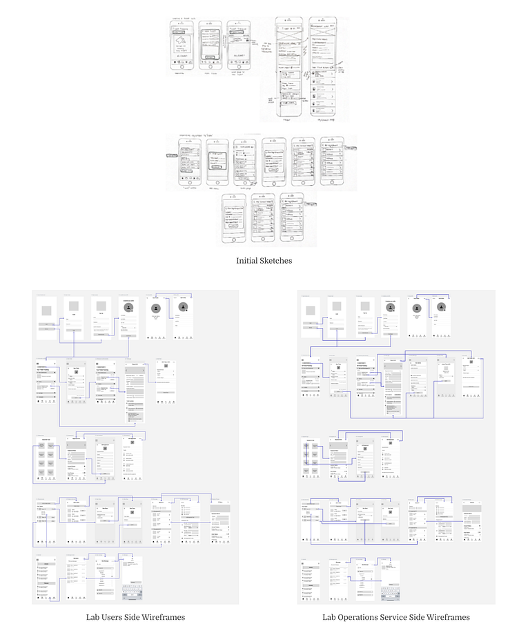
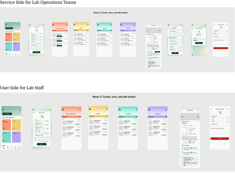
06. Selecting my best ideas and creating user flows
After selecting my best ideas, I decided to create a Service Side App for the lab operations team and a User Side App for lab staff to report problems - similar to service apps like Uber. I created and selected my most priority user stories for both apps and created flow diagrams, sketches, and low fidelity wireframes of these routes. I ran guerrilla testing on my initial sketches for quick design feedback. Most insights included misunderstanding of certain icons and terminology that needed to be reworded or simplified.
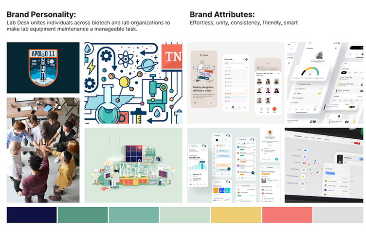
07. Creating a brand guide that values intelligence, calming, and friendly
I then created a mood board to get a sense of the kind of brand I want Lab Task to portray. It is important to me to create a brand that is smart and friendly because a lot of design in science can come off outdated or dry. I then assembled my style guide help create my High Fidelity Mockups.
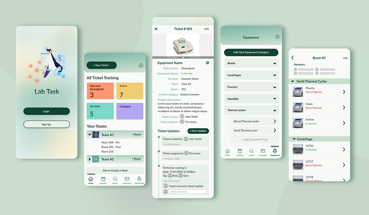
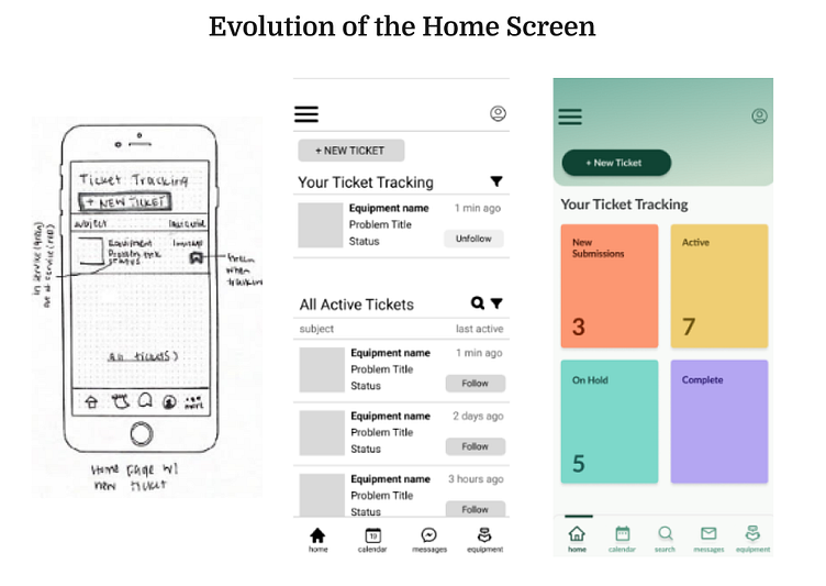
08. Redesigning decisions to better organize large amounts of tickets
At this stage of creating my High Fidelity Mockups, I made a few changes to my original design. I started to consider my constraints like types of tickets and space and this evolved my home screen into a more simple dashboard.
Also the main differences between the service side and the user side are that the service side has the ability to assign tickets to lab ops employees, create appointment, and add status updates to tickets.
09. Following user suggestions for reorganize and ease of use
The final step to my project was usability testing and redesign. I first tested my protoype with five lab employees in biotech and decided which app they would test based on their job responsibilities. I conducted these tests in person or online via Microsoft Team. The following are the main findings and redesigns I made for before releasing the final design of Lab Task:

Conclusion and Future Steps
Another round of usability testing was conducted before the final redesign of Lab Task was completed. Lab Task has proved to be intuitive and easy to use by real Biotech employees and design methods were demonstrated to the UX Designer at the Biotech company I currently work as apart of the lab staff. In the future I would like to build out more features of great help desks like self servicing options and viewing ticket stats.
In conclusion, the Lab Task Mobile App was my first experience with designing a product from start to finish and I’m glad that I designed a topic relevant to what I currently do for work. It has been a perfect transition from Research Associate in a Molecular Biology Lab and into UX design. I look forward to branching out to different projects next.


