A Different Path logo


My entire December‘s creative work revolves around the colour green. And the biggest contributor to that is Scott—a client, a visionary and a helpful soul.
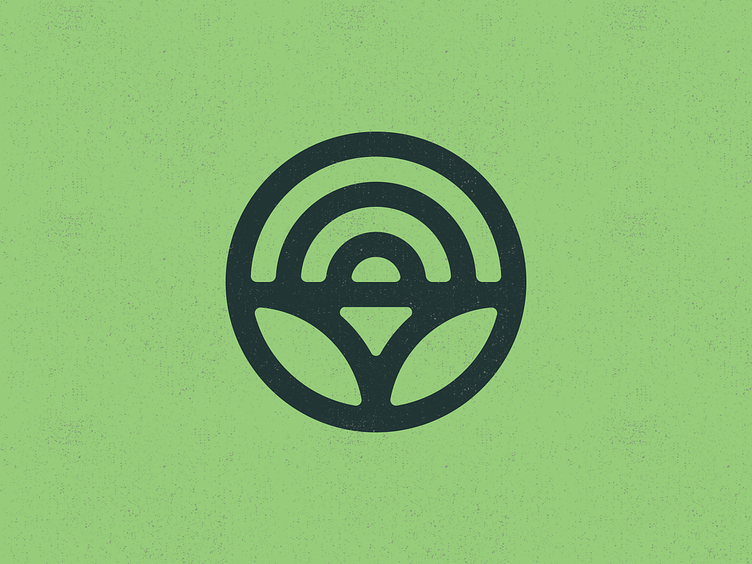
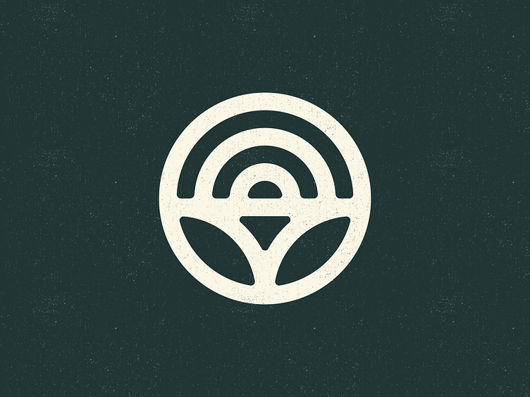
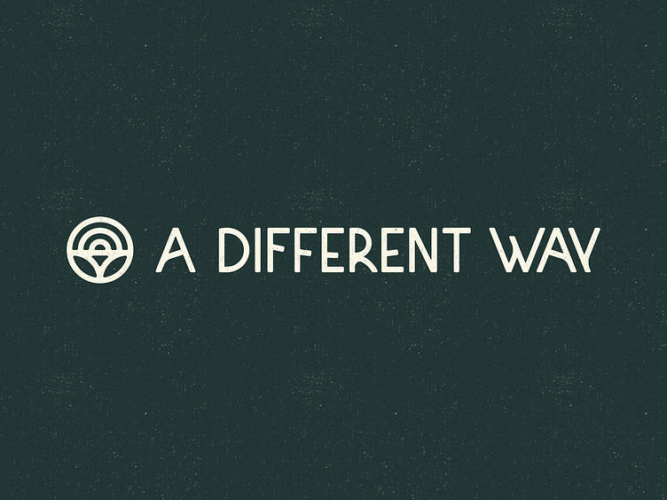
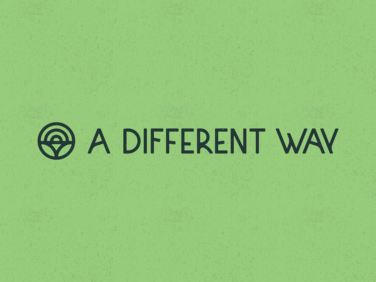
For the logo redesign, I constructed a custom font that is legible enough but also organic, resembling branch stems. It‘s supported by a mark that purposefully has no clear meaning but alludes to a feeling of joy, support, and optimism.
~^~^~^~
A Different Way is a collective of sustainability professionals, social entrepreneurs and change-makers helping leaders and teams to transform their businesses in resonance with themselves and create an impact at scale.
~^~^~^~
This is a work in progress, and the new logo, alongside a new website, will be published on www.adifferentway.life.