Find designers
Designer search
Quickly find your next designer
Post a job
The #1 job board for design talent
Inspiration
Courses
UX Diploma
Learn UX design from scratch in 6 months
UI Certificate
12-week UI skill building for designers
Live interactive workshops
with design professionals
Jobs
Go Pro
Log in
Dribbble: the community for graphic design
Log in
Sign up
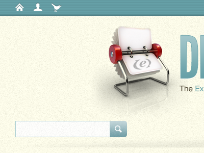
Director-ee
Andy Johnson
Follow
Following
Like
#F8F7E8
#649BA2
#C9C7B9
#ABC4C7
#8E847B
#524842
#9E3B3C
Download color palette
app
cream
expressionengine
texture
View all tags
Posted on May 11, 2010
533
0
1
5
View feedback
Andy Johnson
More by Andy Johnson
View profile
Previous
Next
Loading…