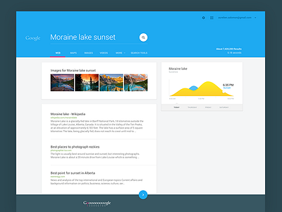
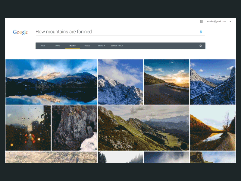
Google.com transitions


Hey bros,
As promised on other shot, here is a visual exercise I did this week end.
I took the linked shot as a context for this exercise. From the Google home page to search results, to images etc, there are currently no transitions (many good reasons for that). But I just wanted to explore something with a more fluid flow and to guide user attention a bit more.
It is just an exercise as usual, it is not better, many flaws, but just a concept.
Some ideas
- Bigger textfield for the home page. I chose to go with a more minimalistic style this time that would be more adaptable with the Doodles.
- The Mic size decrease until a certain point to indicate that the recording will end.
- A little card animation
As usual, have a great day!