Branding For Casual Restaurant

OBJECTIVES
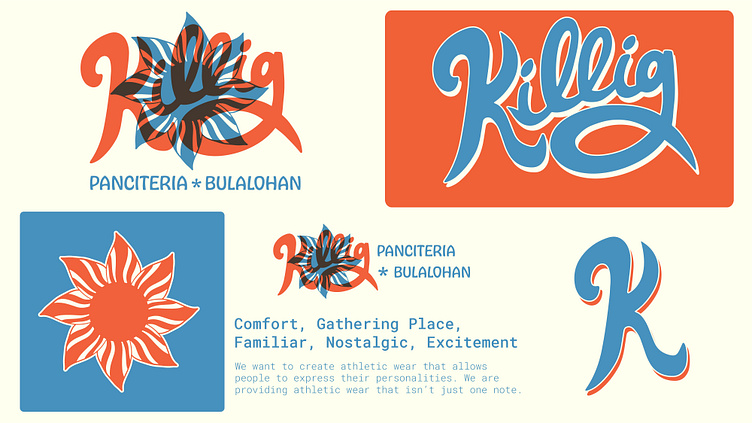
We were thrilled to reconnect with Seattle based Filipino chef Melissa Miranda to design the brand identity for her new casual dining restaurant Kilig. We designed the rebrand for her fine dining restaurant Musang earlier in the year. For Kilig’s brand identity, Melissa wanted us to create a more playful aesthetic to match the casual feel of the restaurant and simplicity of the menu. With this objective in mind we created the 3 concepts below to illustrate our creative direction for the project.
DELIVERABLES
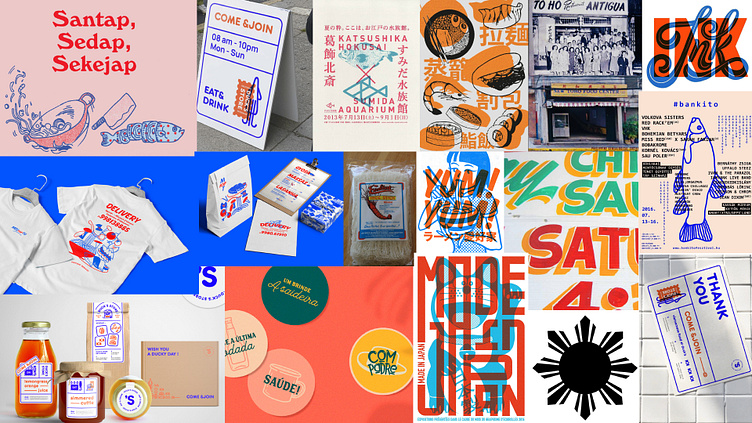
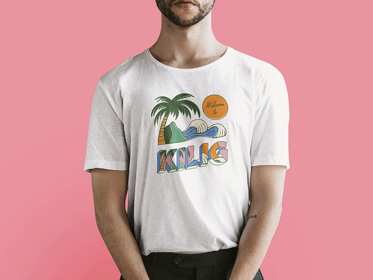
Brand Strategy | Creative Direction | Brand Identity | Graphics Kit | Social Media Templates | Branded Newsletter | Apparel | Signage | Packaging | Style Guide

STRATEGY
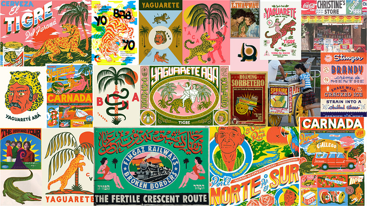
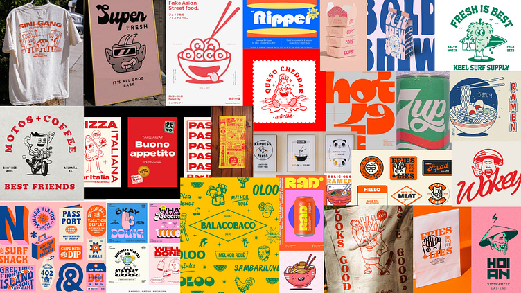
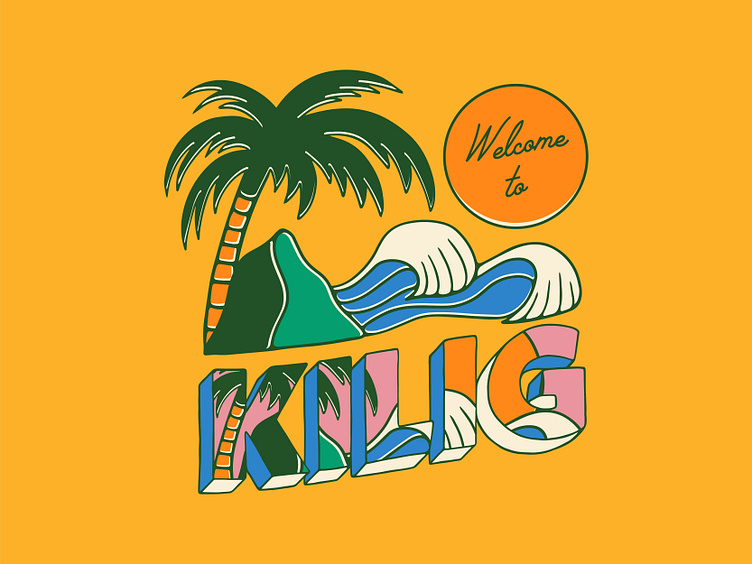
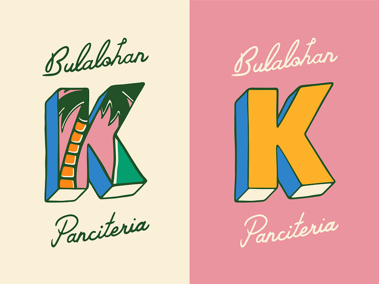
In our brand strategy workshop, we identified the Filipino coastal destination La Union, circa 1974, as a major stylistic influence for the brand identity. We wanted the brand to give the user a feeling of going on a summer holiday to La Union on their lunch break. Melissa and her team chose the first concept presented above as this gave them that feeling.
TAGLINE
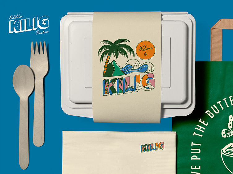
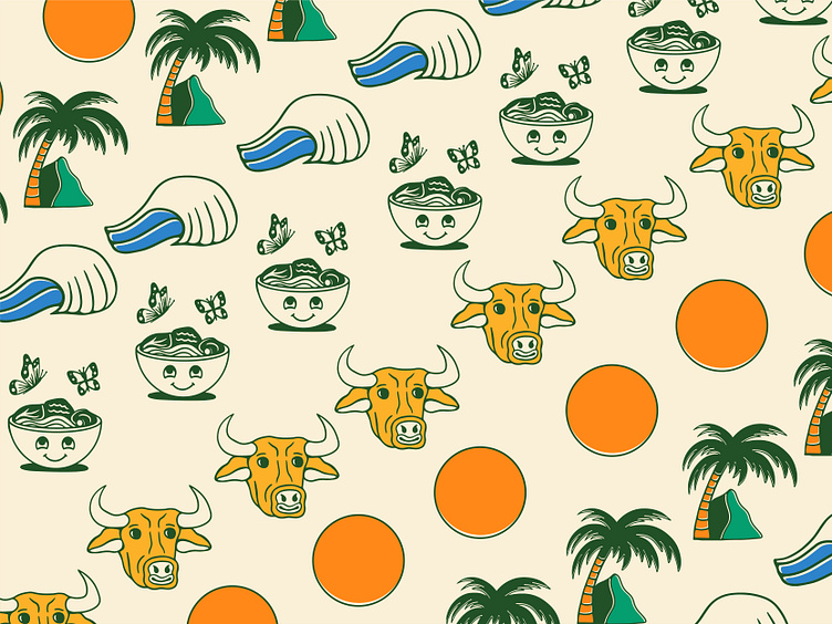
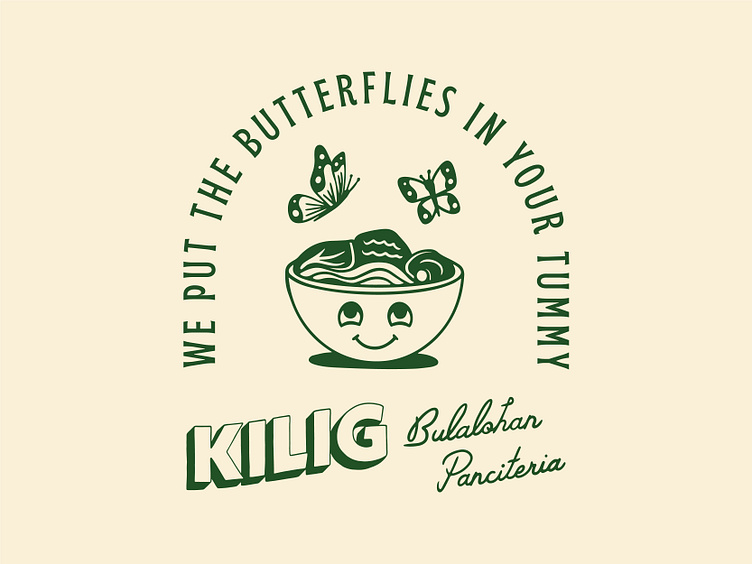
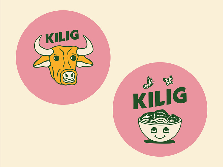
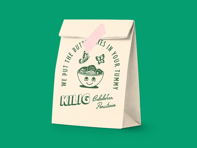
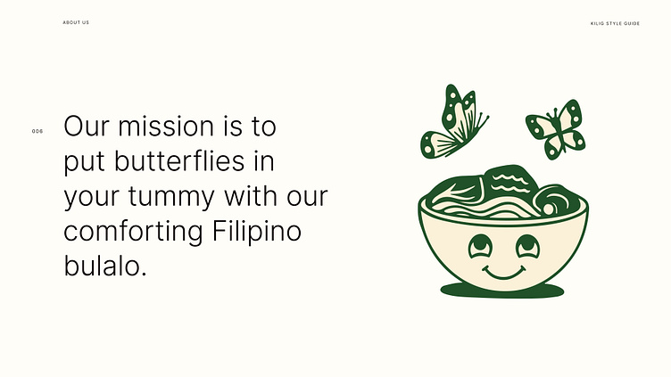
Kilig means 'the feeling of inexplicable joy' in the Filipino dialect Tagalog. We used this wording to create the tagline "we put the butterflies in your tummy" to describe the excited feeling the user gets when they eat a bowl of delicious Filipino bulalo soup. We illustrated this feeling with a bowl character smiling up at butterflies.


DESIGN
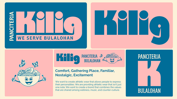
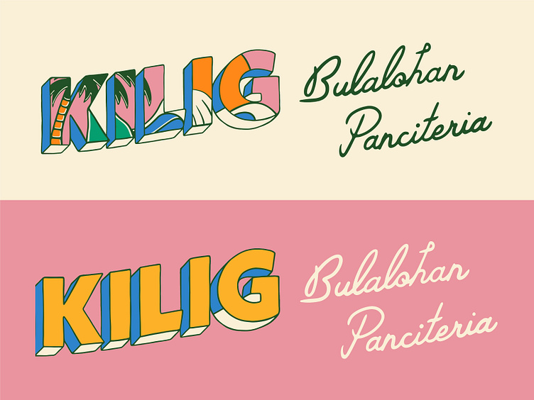
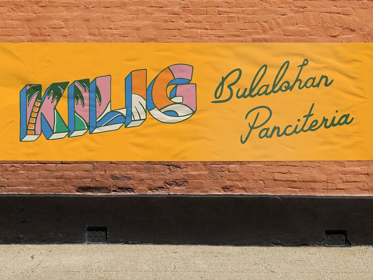
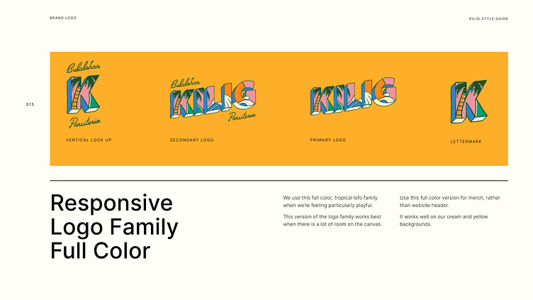
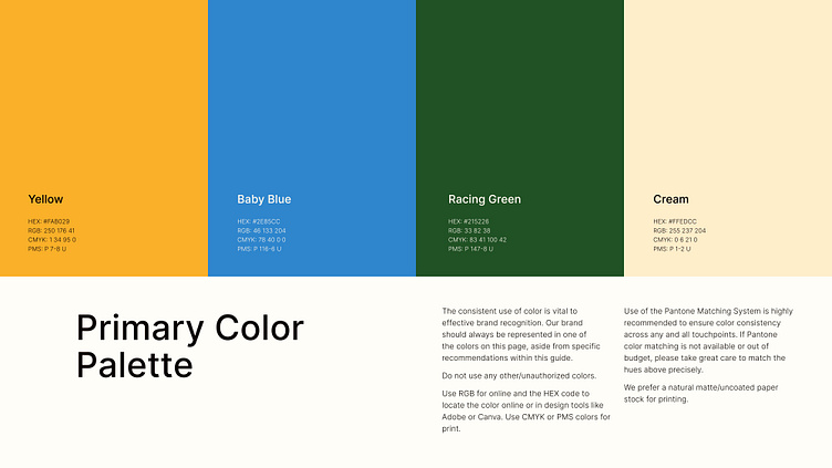
We took inspiration from vintage, coastal postcards for tropical imagery. We also liked the feeling created by hand painted Filipino market signage. We merged these influences to create a hand drawn wordmark logo that was bold, simple and easy going. We added drop shadow to give a 70s feel and surfy illustrations to give the nostalgic feeling of summer holidays at the beach. Using this direction we created a responsive logo family in full colour and an alternate colour palette. We used a vibrant and beachy colour palette to represent La Union. We complemented this with brand fonts that felt suitably playful while being easy to read on website, signage and packaging.

RESULTS
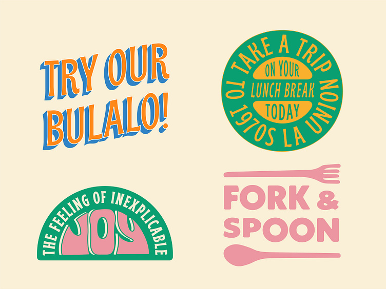
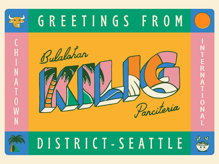
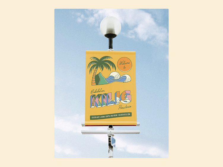
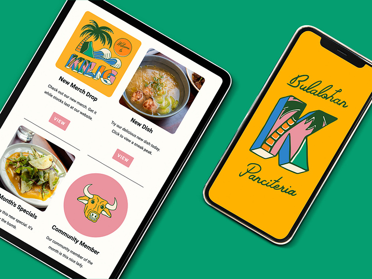
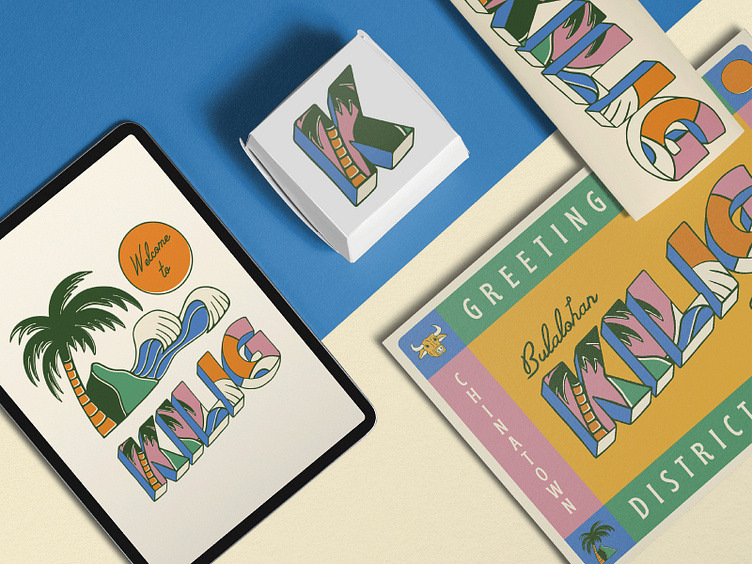
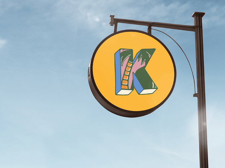
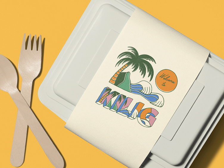
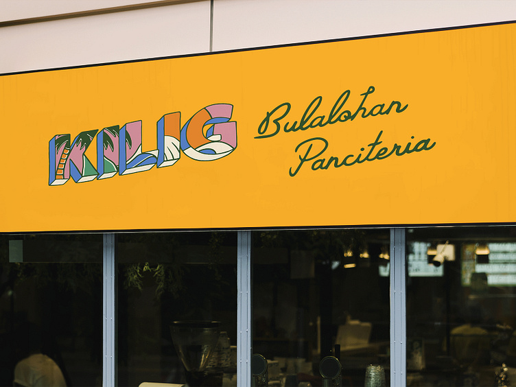
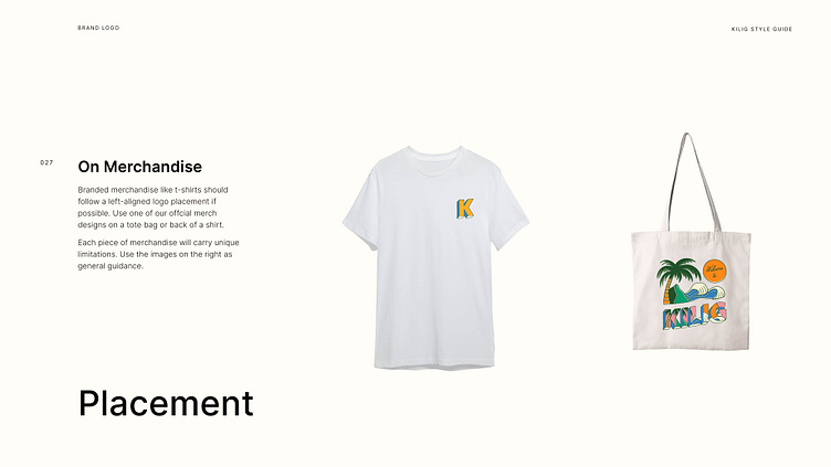
Building on this tropical brand identity, we added a graphics kit of hand drawn illustrations and custom typography. We used these guidelines to create signage for the restaurant and packaging for the takeaway food. To promote the restaurant we designed a marketing campaign with assets including social media templates, newsletter, street ads and posters.
We brought everything together with a detailed style guide which gave the Kilig team all the instructions they needed to grow their brand. This included guidelines on logo usage, typography, colour, graphics kit, merchandising, marketing, messaging and photography.
The result was a bold, playful and tropical brand identity that represented the casual and simple nature of the restaurant whilst appealing to its fun loving and easy going audience.

Thank you for reading. For more case studies like this visit our website.


