Find designers
Designer search
Quickly find your next designer
Post a job
The #1 job board for design talent
Inspiration
Courses
UX Diploma
Learn UX design from scratch in 6 months
UI Certificate
12-week UI skill building for designers
Live interactive workshops
with design professionals
Jobs
Go Pro
Log in
Dribbble: the community for graphic design
Advance your career with a Professional Diploma in UX Design
Learn more
Log in
Sign up
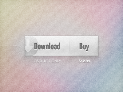
Download or Buy v.2
Matthew Skiles
Available for work
Follow
Following
Like
Get in touch
#CAB2B1
#DAD3D2
#D1C8B6
#A7A1AB
#747479
Download color palette
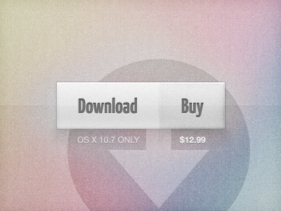
Thanks for the feedback guys. What do you think of this approach?
Rebound of
Download or Buy
By
Matthew Skiles
buy
download
muted colors
texture
View all tags
Posted on Jun 26, 2011
9,215
20
249
18
View feedback
Matthew Skiles
Get in touch
More by Matthew Skiles
View profile
Previous
Next
Loading…
Loading…
Loading…