Slider Control in UI design | patterns and examples

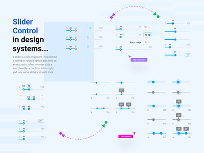
A slider is a UI component representing a tuning or volume control dial from an analog radio. It lets the user slide a knob, handle or bar from left to right and vice versa along a straight track. UI sliders are great for allowing users to explore many different options or values quickly and simultaneously. Above all, they’re practical components for users when quantities or values don’t need to be exact.
UI slider design helps users select a range of values or adjust settings like brightness or volume, among other uses.
Numeric Range Slider. Provides the option to select a range of numeric values intuitively by using two handles.A range slider usually fills the color between the handles to indicate selections.
Single Value Slider. This simple slider control allows users to select a specific numeric value from a range.Fill selection option is available to indicate the selected range visually.
Custom Slider. The user can customize slider type as needed, including date range slider, time range slider, price range slider, rating slider, custom values, and more.
...
So which tasks work best with a slider? Sliders can, after all, serve many tasks, going far beyond the simple volume slider control. They can be a handy way of helping users narrow down their search without getting into the minor nitty-gritty details. For example, you may have come across slider controls that let you select a price range for mortgage down payments or the even dimensions of electro domestic items.
Hope you enjoy it! Thanks for your likes !
Get in touch with me:
Behance | LinkedIn | Instagram
Contact me: linc.effect@gmail.com


