DailyUI 035 - Blog Post
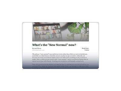
The layout for this page is a generic, photo at the top and then title and information straight underneath it. This seems like the layout that works the best but it just looks a bit boring. Perhaps because of the two empty strips of white on either side of the article.
I also added a reading time, since users might like to know how long it would take them to read the article. It's placed on the right, as they read through the title, author, date and then if they still decide it's worth their time, they can see the reading time as their eyes go from right to left.
View all tags
Posted on
Nov 19, 2022
More by Sharon Wong View profile
Like


