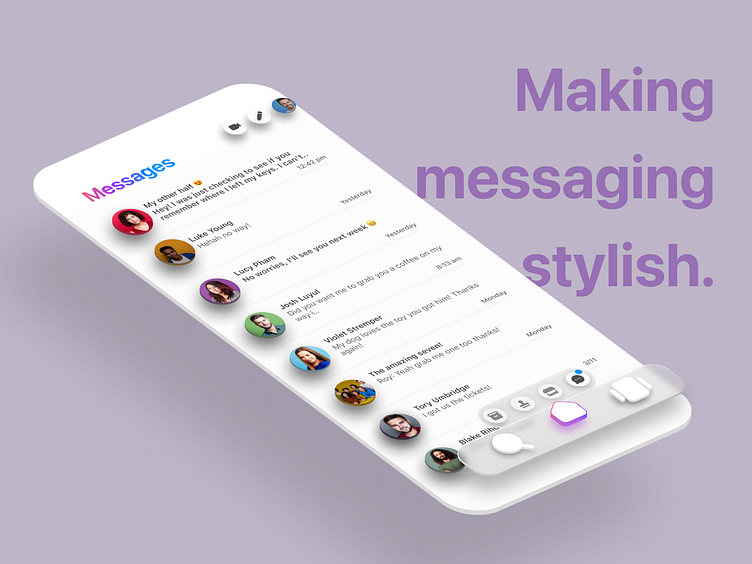
Making Messaging Stylish

Design Goal.
It's no secret that "Messenger" is widely used. It's surprising to see a platform run by one of the world's largest tech giants so far behind in its visual impact.
The goal behind this design was to simplify the way the user interacts with the app. This was done by reducing the on-screen elements and improving the overall aesthetic.
Design Choices
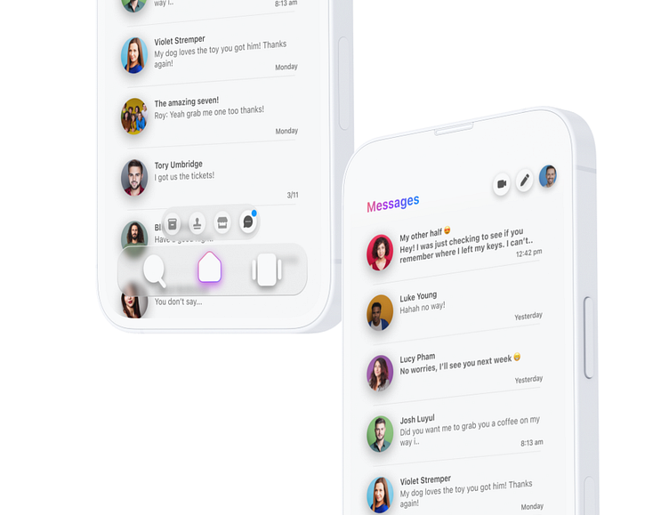
For this project, I wanted to experiment with a glassmorphic design and a depth to the elements on screen. This was done by choosing to layer a transparent navigation bar over the main content of the screen adding prominent shadows to intractable components.
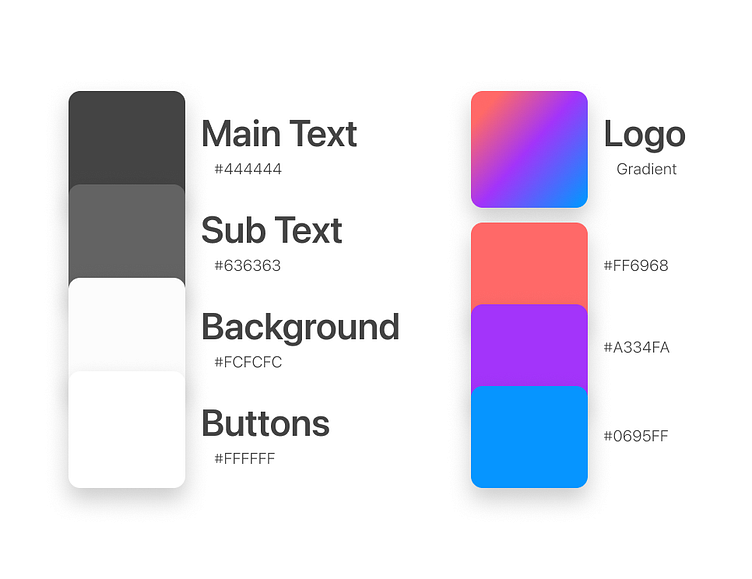
Colour Palette
The colours chosen were kept quite simple to allow the focus to be on the messages themself, after all, it's why the app is used.
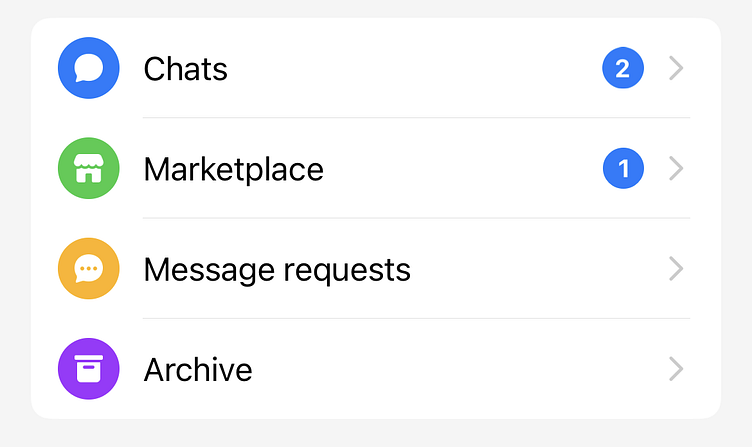
Removing the Sidebar.
The side-bar felt like an unnecessary click. I decided to replace it by adding a small nav bar that appears when on the home screen. It lets you quickly switch between your main, marketplace, pending and archived chats.