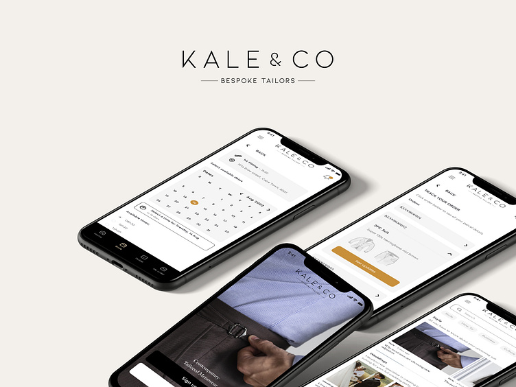
Bespoke Tailoring App

The Problem
Kale & Co Bespoke Tailors operates as a bespoke tailor based in Cape Town, offering luxury made to measure suits. The owner is the sole service provider of all appointments with little spare time to manually liase appointments and update clients on their orders.
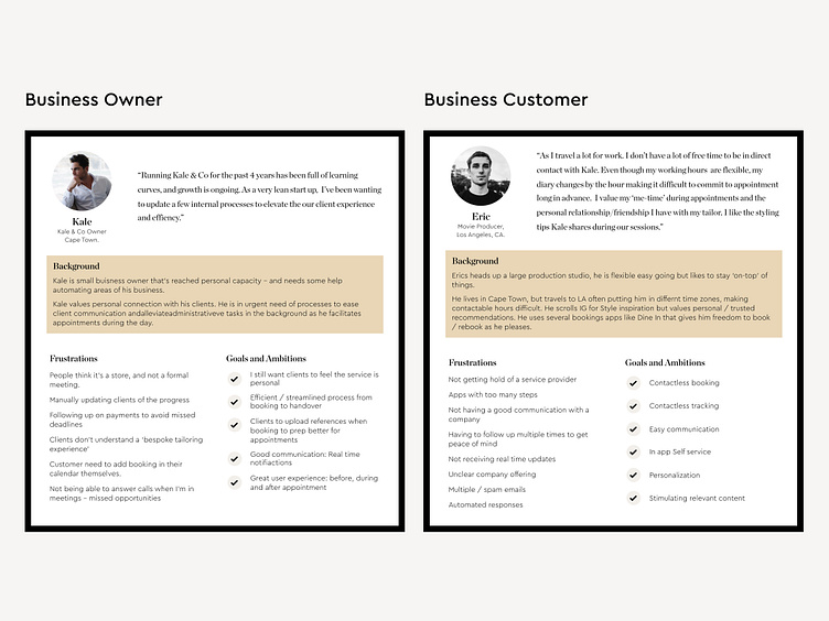
Personas: their needs + problems
As South Africa doesn’t have a strong tailoring culture the owner expresseed that clients often show up to appointments not understanding what to expect, and require a lot of guidance during appointments. Kale & Co approached me to address 3 problems: Booking, Education and Tracking of orders.
The Solution
An educative app, that enables an easy booking and tracking process.
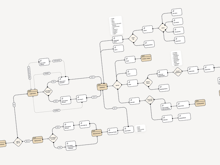
User flow
Mapping out the 3 areas of concern were impossible without a sign up flow. The Booking, Tracking and Style Guide userflows were fairly simple and included the users’ and owner’s concerns around: Easy user experience, streamlined self service and a personal touch.
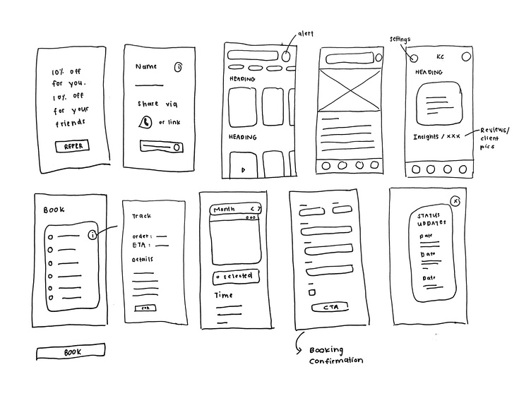
Wireframes
With pen to paper, I liked where my low fidelity wireframes were heading. A few ideas ended up in paper airplanes, alas! The result translated into minimal Visual design screens very close to the wireframes.
Visual design
I kept with the company’s Brand guide: a classic black and white with hints of prestige colours. I initially used square buttons and elements as I felt it was quite professional, but early feedback suggested it felt more desktop like and not ‘app’-y enough.
I also included a lot of lifestyle images to convey the brand’s CI. An updated font was suggested and the feedback was positive...“this type is screaming: luxury segment. “
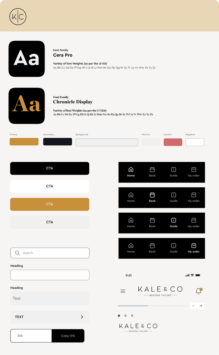
A quick glimpse at the system that will continue to grow as I build more screens, and develop the app further.
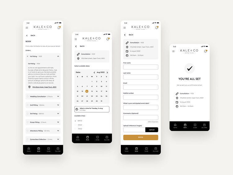
Booking
As ‘Booking’ was one of the main features of the app, I wanted to make it a short and simple including types of bookings (with time estimates), email notifications to add to user’s calendar and uploading references all in one place. Users also have the option to view their booking history and amend or cancel bookings in the app.
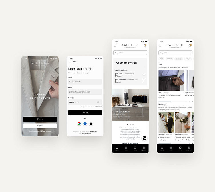
Onboarding
A 2-step onboarding experience with the ease of signing up and via social networks takes users to a personalised Dashboard with quick and accesible info.
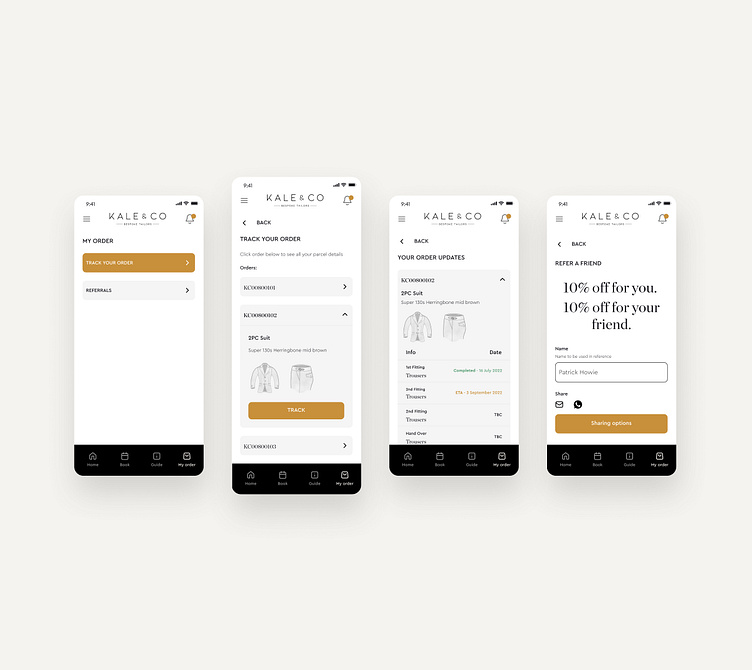
Tracking
Another main focus of the app is to give users / clients a way to track their orders in real time. Simple illustration were introduced to easily showcase relevant orders, progress and ETA’s.
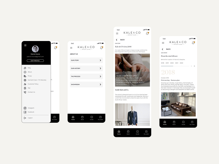
Burger Menu Navigation
This additional navigation menu was suggested as a way to digest extra information and not overcrowd the Tab bar. This was well received while prototyping.
Prototype
To test the design I sent out a prototype testing the booking, tracking and burger menu. All 6 users were able to complete the tasks with ease and the overall feedback said the process felt familiar.
Some suggested changes included:
Logo that was difficult to read on the splash screen - a video was added instead.
Clearer CTA on the booking page - grey button was changed to primary Golden colour.
Video shows final version of the the prototype:
Outcome + Results
I have learnt to listen closely to the needs of users and really develop my design-led approach; leveraging empathy, encouraging divergence and navigating ambiguity. As a junior product designer I was thrilled to take on this project on my own being able to express my minimal UI aesthetic.


