Oakley - concept app

Oakley App concept
Oakley don't have an app, but if they did it might look like this!
Aiming to post a new concept or idea every few days, this is today's.
Thoughts... 💥
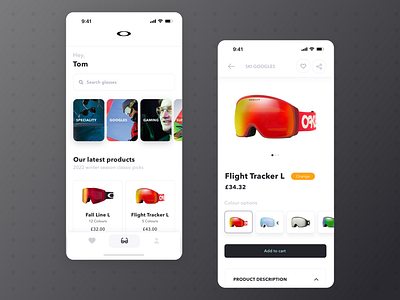
Oakley have a pretty minimal brand, which is lovely to work with.
Sticking with the minimal look, I kept black as the primary colour and leant heavily on a grey colour for anything that wasn't meant to stand out as much.
Getting the right Images is so important for a design. Oakley have some really nice photos of their products. Mostly 3D renderings with perfectly white backgrounds, which make the colours really pop and helped massively with the places I could take the design.
Aim was to have just three menu options, favourites, glasses and your user account. I'm don't love the bottom menu, I think if I had a bit longer I could think up another menu option which would make it look a bit fuller.
Thats all, hope you liked it ✌️.


