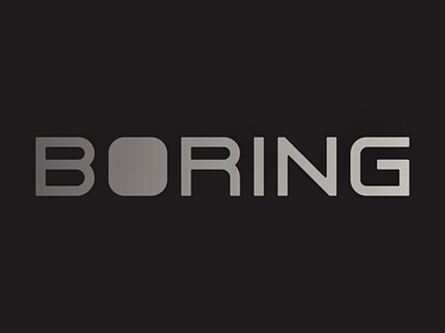
BORING
Some custom type, i’ve been enamored with rounding fonts lately (removing all sharp corners), and have been experimenting with crafting my own. Here I used it to reimagine the Logotype For The Boring Company, turning the more playful word-mark into something more industrial (something more boring).
branding
custom
design
graphic design
illustration
illustrator
lettering
logo
sans serif
typography
vector
View all tags
Posted on
Nov 1, 2022
More by Micheal Johnson View profile
Like


