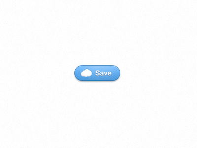
Cloud Button Redux

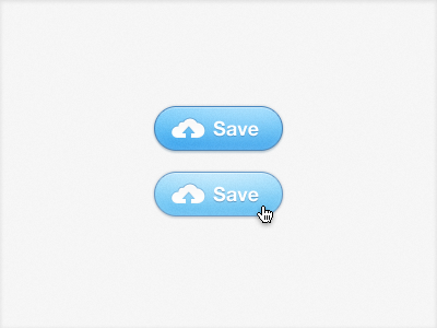
An updated approach to a save button which indicates that your information is going to the wonderful "cloud." After looking, I now realize that the cloud shape mimics MobileMe's too closely. I'll pull the points in different directions before using this live. Thanks for the feedback on the last button.